12 min read
Your no-BS guide to successful ad creatives
Try searching for


“Do I really need a web page to promote my mobile app?”
It might seem counter-intuitive when your business is all about mobile, but a good app landing page can actually play a big part in your user acquisition efforts: it lets you bring in traffic from across the web, and gives you more space than the App Store or Google Play to showcase your app.
When users are delighted and intrigued by an attention-grabbing landing page that proves the value of your mobile app, they’re more likely to hit that all-important download button on their phone or tablet.
Want to see how it’s done? Check out key takeaways from some leading brands and consider applying them to your 2023 web-to-app strategy.
The clue’s in the name: your landing page is where people “land” after clicking on an ad for your mobile app — be it on social media, in a paid article or video, or even via a QR code.
In essence, it’s a web page designed to advertise your mobile app to potential users. It’s typically a single page with fairly minimal copy and prominently displayed download links.
This is your space to convey your app’s value to potential users, which they could easily miss if they’re just browsing through their iPhone or Android stores. Look at it as your best chance to convince visitors why they should give precious mobile storage space to your app, and roll from there.
Now that we’re clear on what an app landing page does, let’s look at some more of the benefits of creating one.

No two landing pages are exactly the same — and why should they be? When you build an app landing page, you need to design it with your end goal in mind (getting a download), while also factoring in brand awareness and the purpose of your app.
Larger companies can rely on brand awareness more, while lesser-known ones may need more copy to explain what it is they do and why their apps could offer unique value to their users.
Here are the basic steps to get you started:
Like your app itself, the design of your landing page needs to be rooted in research that’s laser-focused on your target market.
If you’re marketing to a certain age group, your copy and images need to be tailored to what appeals to them. Marketing to millennials is not the same as marketing to Gen Z’ers. Leverage the same demographic research that you used when building your app, or if your landing page is even more targeted, work with others in the marketing team to strategize.
Once you have that research in hand, you can think about how best to approach your audience and what will get them to convert.
Your mobile app landing page isn’t designed to be a complete guide to your app, where you lay out every feature. Think of it more like a movie trailer that gives visitors just enough information that they’re intrigued enough to download.
Include eye-catching elements, like screenshots of the app, bold calls to action (CTAs), and rave reviews or testimonials from outside sources.
Just make sure to optimize your media for the web, as slow load times drive people away, especially on mobile.
As far as copy goes, include the content that’s necessary to showcase how you add value, but make it readable with short bullets and catchy headlines to keep people engaged. Rather than listing all the app’s features, focus on the benefits to users (save time, lose weight, find the perfect date, and so on).
Once you have your page designed, make sure the design looks good in mobile and desktop format and be sure to test it out on several devices and browsers before you take the page live.
If you’re going to pair it with any paid advertising or social media platforms, set up those campaigns at the same time.
After the page is live, keep monitoring it to make sure it’s getting the results you expected. If it’s not driving conversions after a given grace period, then you might need to rethink your approach.
Make some tweaks to your landing page template and do some A/B testing to see if that approach is more effective. If that doesn’t work either, you may also need to tweak your paid ad copy and do some testing there, while considering additional publication avenues.
If you want to create a show-stopping app landing page, you’ll need thoughtful design, superb copy, and enticing calls to action that drive a high click-through rate.
Check out some great mobile app landing page examples and what they did right – so that you can shamelessly copy what they’re doing and implement their strategies.
What we liked
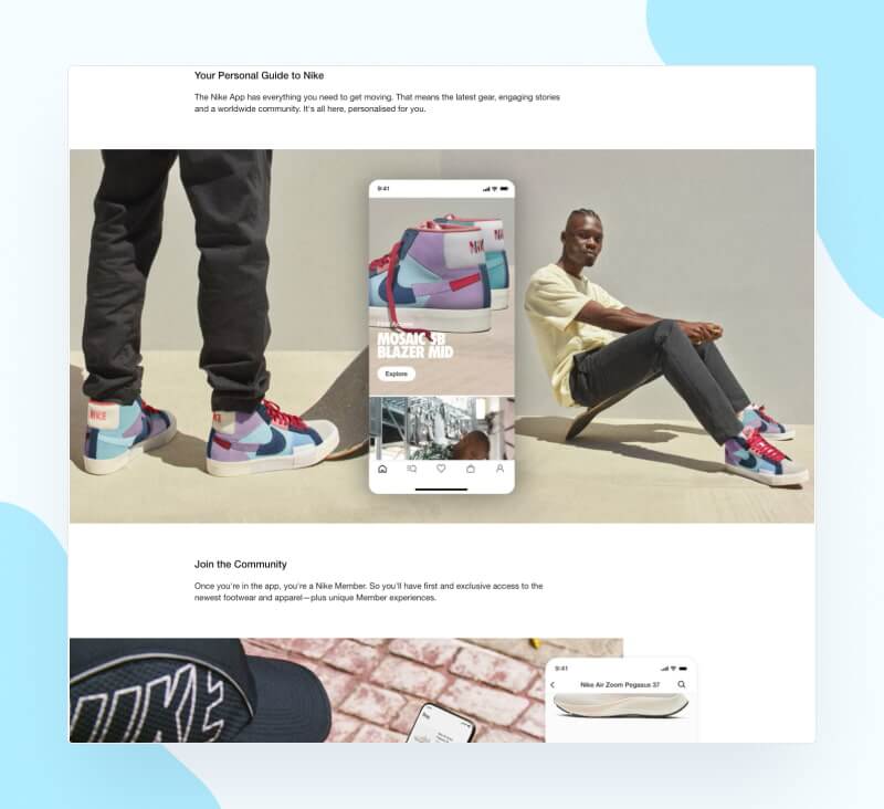
Nike’s app landing page is very action-oriented. The page is laid out to bring in conversions from the get-go, and you can’t miss the QR code in the header that takes visitors straight to the app store.
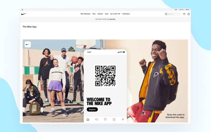
This bold placement shows Nike’s supreme confidence; they immediately hit visitors with a CTA instead of attempting to convince anyone. As a household name, they can get away with this — we all know what Nike represents and the products it offers.
What we liked
While 360Learning’s page is detailed, sometimes that’s okay. They’re targeting businesses (B2B vs Nike’s B2C approach) and use a value-centric copy to spark initial interest.
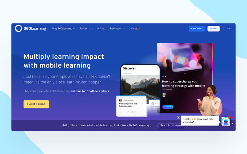
The page starts with screenshots of the mobile learning app so the potential user can get a feel for the user experience, and then moves straight to value add and a CTA button to request a demo.
What we liked
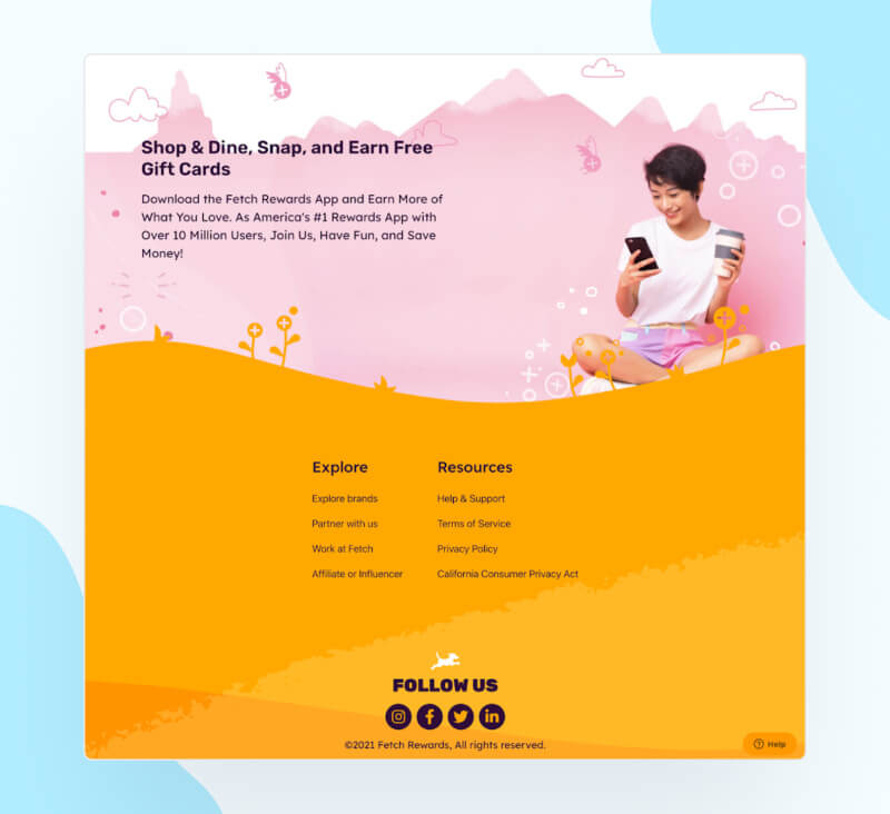
Fetch Rewards provides users with free gift cards for uploading their receipts. It’s a unique concept, and their landing page playfully acknowledges that with an off-kilter imagery.

Like Nike, Fetch puts their CTA up top by placing a QR code and download buttons in the corner of the header. Even better, the QR code is “sticky”, meaning it follows users who scroll down to find out more.
What we liked
Steady’s page offers powerful social proof in the form of testimonials. It clearly shows how the app can affect someone’s life by helping them manage their finances. This is a great example of how to establish trust with a customer, especially when working with people’s money.
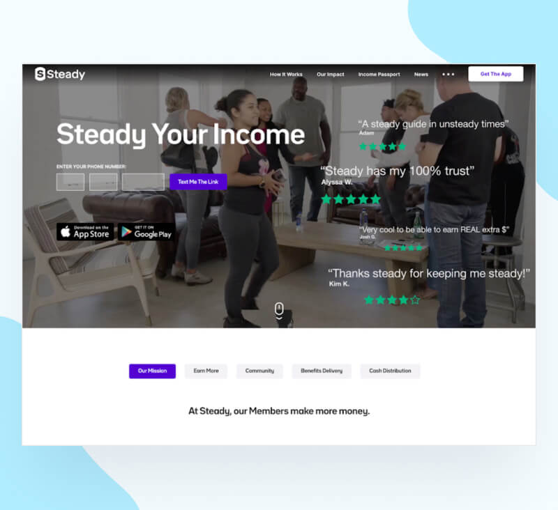
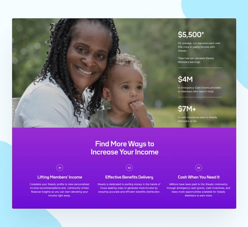
The page’s header uses a background video featuring satisfied customers: it’s eye-catching and intimate. Along with the video, there are multiple CTAs with the option to get a text or download the app.
What we liked
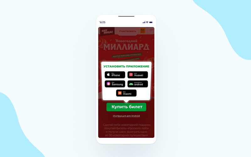
Stoloto, the largest distributor of state lotteries in Russia, set up a landing page on its mobile website that makes full use of powerful rerouting and measuring mechanisms. Using a deep linking platform, Stoloto can deliver users that click on a badge to the right app store (e.g., Google Play, App Store, Galaxy Store, etc.). It can also deep link users that already have the app into the right in-app content.
What we liked
Ibotta gives its app customers cashback on various items, like essentials and groceries, when they upload receipts from certain stores.
Right off the bat, Ibotta offers new customers a great incentive to download their app. This helps push customers to action because, hey, who doesn’t like free money?
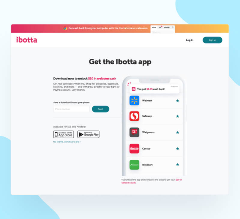
Plus, alongside the standard download buttons there’s a convenient option to receive a download link via SMS — helping users move seamlessly across devices. There’s nothing extra on the page to distract, making it a clear path to conversion.
What we liked
Notion is primarily a desktop app, and the mobile app is designed to supplement that use, so the page primarily focuses on describing the advantages of the mobile app to people who already use it.
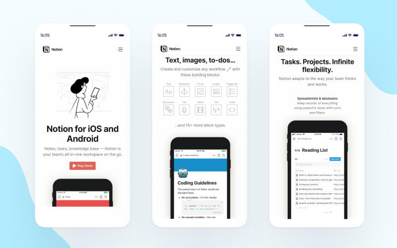
Notion uses white space to its advantage. There’s no colorful background, or anything else to detract from the animation that shows how the mobile app works and demonstrates how useful it is.
What we liked
While many app landing pages provide a button to go to the AppStore or Google Play, GasBuddy uses a different type of CTA. Similar to Ibotta, above, users can request a download link via text, making it especially convenient for desktop users.
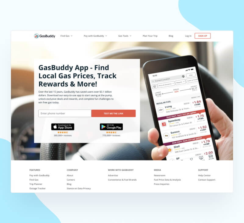
GasBuddy relies heavily on its brand here. It briefly mentions saving customers money, but keeps the page short and to the point. By leveraging their brand awareness and showing a clear screenshot of the app in use, they’re able to eliminate excess copy and get the user right to the goal.
What we liked
Calm is a wellness app that uses an interactive approach to engage page visitors.

Their landing page starts by asking visitors what they’re looking for, and then takes them through a series of questions related to their sleep habits and stress levels, ensuring visitors a personalized experience that will address their specific needs. Note how the visuals exude a sense of (you guessed it!) calm, which is perfectly in tune with the app’s purpose of aiding relaxation.
What we liked
Bark is a mobile app that provides parents with controls for their children’s mobile devices. Immediately, Bark hits the page visitor with statistics that speak to the importance of using their app. Back to that social proof again: if all these other people are using it, maybe I should too.
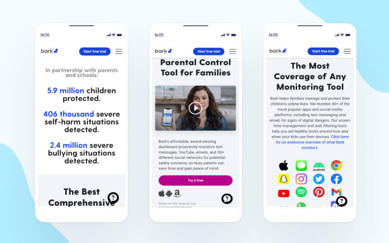
It’s a serious subject, so they don’t employ any frilly copy or excessive imagery: just the facts, and a brief, informative video.
What we liked
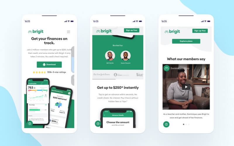
Brigit is a financial services app that helps users rebuild their credit. It’s backed by two influential celebrities, and flaunts that right in the header alongside video testimonials and app ratings, boosting the app’s credibility.