
5 min de leitura
Solucionando o mistério: mensuração completa para iOS no X Ads
Tente pesquisar por


Desempenho tem significado diferente em diferentes empresas. O estágio do crescimento da empresa, os objetivos e o tipo de negócio determinam quais tipos de dados devem ser analisados para responder a uma única pergunta: qual é o desempenho do aplicativo X?
Cada aplicativo móvel é, e deve ser, analisado com KPIs de sucesso distintos, o que ajuda as equipes de marketing e de gestão do aplicativo a entenderem de verdade o público específico.
Por isso, a AppsFlyer está lançando hoje um novo Painel de Atividades com várias KPIs e tendências novas, munindo você de todos os dados e insights necessários para potencializar seu crescimento.

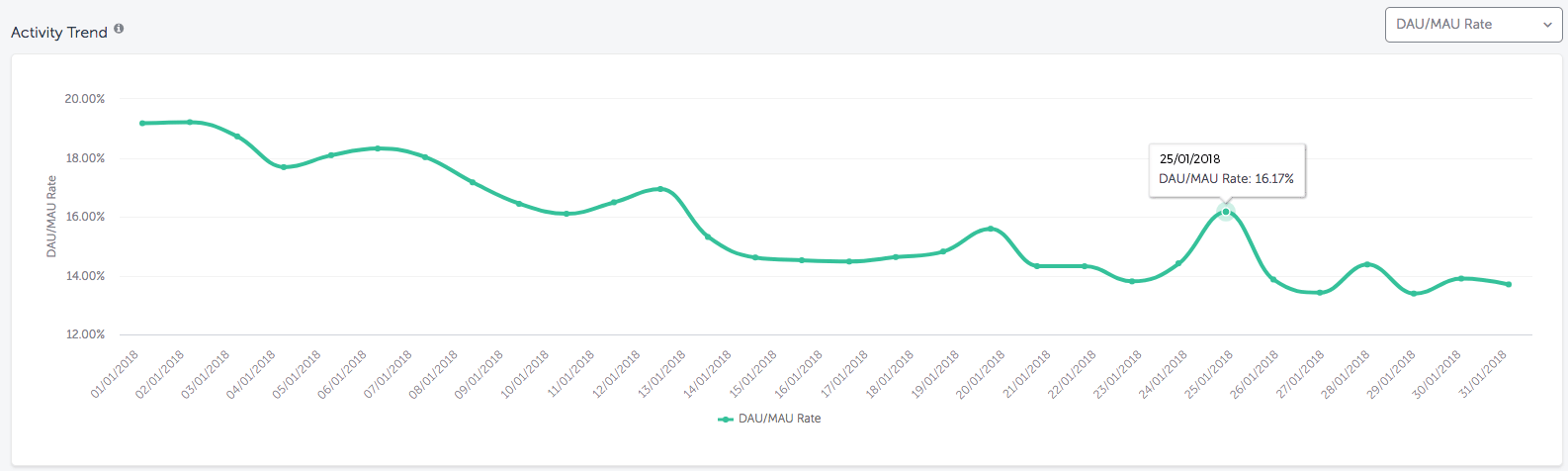
A aderência do aplicativo é a chave para analisar a frequência do engajamento de seus usuários.Para calcular a aderência, dividimos o UDA pelo UAM e chegamos a uma porcentagem. Quanto maior for a taxa UDA/UAM, maior será a frequência com que o usuários se engajam com seu aplicativo.

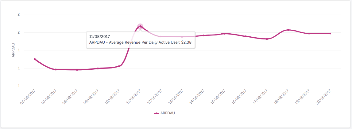
Receita Média por Usuário Ativo Diariamente (ARPDAU, em inglês) é a chave para acompanhar o desempenho de monetização de aplicativos móveis. Profissionais de marketing de apps usam a ARPDAU para comparar o desempenho da monetização ao longo do tempo.Para calcular a ARPDAU, calculamos a média de receita por usuário em um período escolhido e então dividimos pelo número de usuários individuais no cohort (grupos) nesse mesmo período.
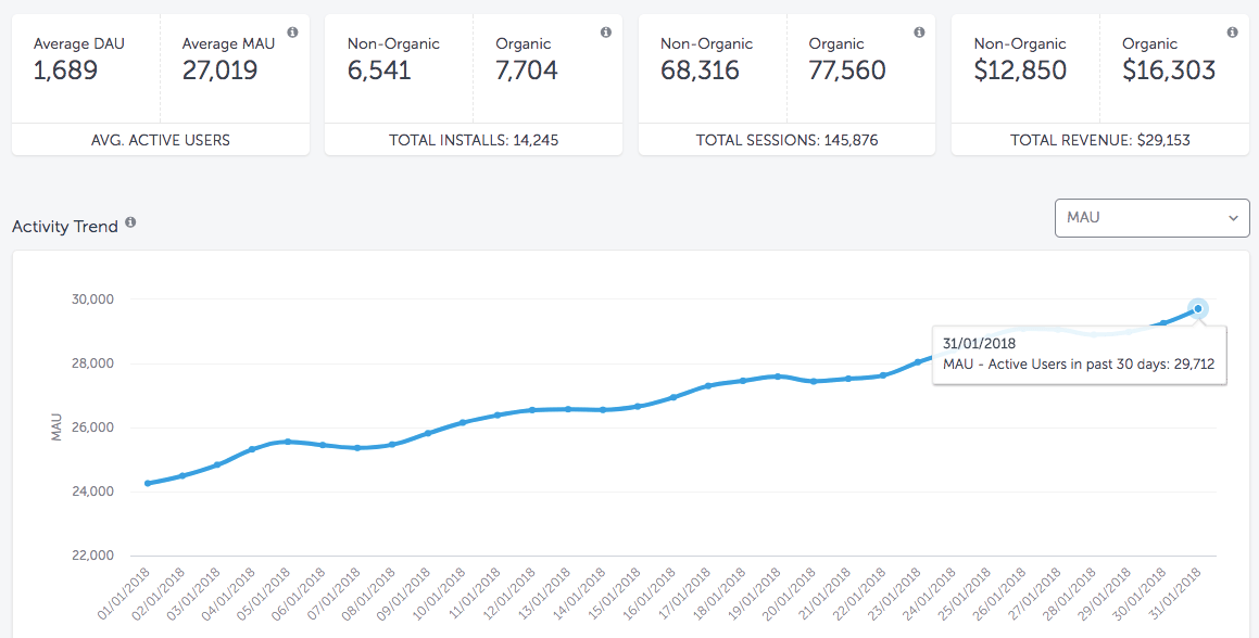
Usuários Ativos Mensais (UAM ou MAU) informa a quantidade de usuários que se engajaram com seu aplicativo nos 30 dias anteriores ao período de tempo selecionado. Ao lado da UDA, a UAM é uma ótima métrica de engajamento de aplicativos para analisar as tendências de engajamento dos usuários ao longo do tempo.
Exemplo: a taxa de MAU no dia 31 de janeiro informará o número de usuários únicos que se engajaram com seu aplicativo entre 1º de janeiro e 30 de janeiro. Neste exemplo, um aumento na taxa de MAU indica uma melhoria no valor do usuário ou qualidade do aplicativo.
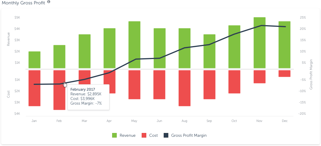
Considerando que os números de ROI em seu dashboard são coagrupados pelas datas de instalação, custos e receitas, o Dashboard de atividades mostra o custo real, receita e lucro que ocorreu durante um período de tempo selecionado.Isso é muito útil quando você quer extrair os dados com base em datas fiscais ou de calendário para criar relatórios comerciais, QBRs (análises comerciais trimestrais), etc.
O Dashboard de atividade agora permite que você filtre e classifique os dados por um número de pontos de dados disponíveis, como fonte de mídia, localidade e muito mais. Isso permite insights mais rápidos sobre o que realmente importa para você.
Exemplo: digamos que você está interessado em saber qual fonte de mídia impulsionou seus usuários mais engajados nos EUA durante um período de tempo específico. Usando o filtro de localidade e selecionando os EUA, você pode olhar todas as fontes de mídia que ocasionaram o tráfego dos EUA e tem a maior taxa de DAU/MAU
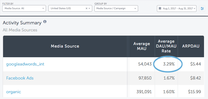
Neste exemplo, você pode ver claramente que o Google Ads atraiu os usuários mais engajados nos EUA para esse período específico. Caso essa empresa deseje adquirir usuários mais engajados nos EUA no futuro, o Google Ads seria uma ótima fonte de mídia para investir.
É importante lembrar que, embora o LTV e outras métricas em seu dashboard de visão geral representem uma análise cohort por data de instalação dos usuários; as métricas no Painel de atividades não são agrupadas e representam os dados reais para o período selecionado.
Neste exemplo, você pode ver claramente que os anúncios do Google conseguiram os usuários mais engajados nos EUA para esse intervalo de tempo específico. Se essa empresa deseja adquirir os usuários mais engajados nos EUA no futuro, os anúncios do Google seriam uma fonte de mídia excelente para investir.
Para realmente impulsionar o crescimento de usuários e aumentar a retenção e monetização, você precisa ter insights profundos sobre o comportamento do usuário. O novo Painel de atividades da AppsFlyer vai ajudá-lo a conseguir isso.
Para saber mais sobre o Painel de atividades da AppsFlyer, converse com seu gerente de sucesso da AppsFlyer ou agende uma demonstração hoje mesmo.