
ВРЕМЯ ЧТЕНИЯ: 4 МИН.
Шаг к прозрачности: представляем полноценное измерение для iOS в X Ads
Попробуйте поискать


В июле прошлого года мы объявили о новых когортных отчетах, и, как и обещали, занялись разработкой новых функций.
Эти новые функции призваны предоставить вам более глубокие инсайты относительно того, как пользователи взаимодействуют с вашим приложением.
Зачастую маркетологи тратят деньги на привлечение новых пользователей, а в итоге целевой аудиторией оказываются уже существующие пользователи (или наоборот). Это наложение может вызвать немало проблем при анализе эффективности рекламы. Для того, чтобы корректно анализировать когорты, маркетологам нужен инструмент, позволяющий выделить нужные инсайты и принять правильные решения.
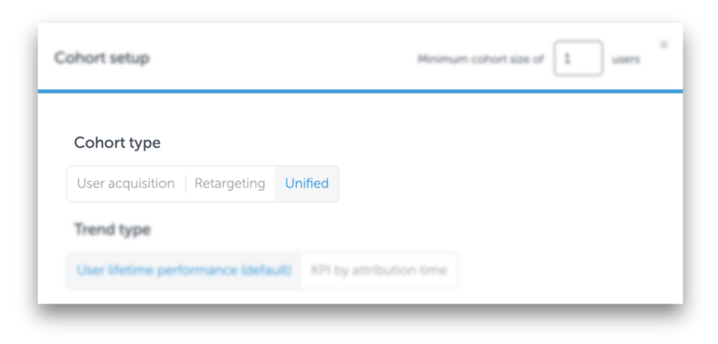
С новым, единым представлением данных, специалисты по UA и ретаргетингу могут получить точную разбивку по затратам и эффективности рекламных кампаний как для новых, так и для существующих пользователей – в одном месте.
Такое единое представление критических KPI позволяет маркетологам увидеть истинный ROI своих кампаний и проводить необходимую оптимизацию на каждом этапе.
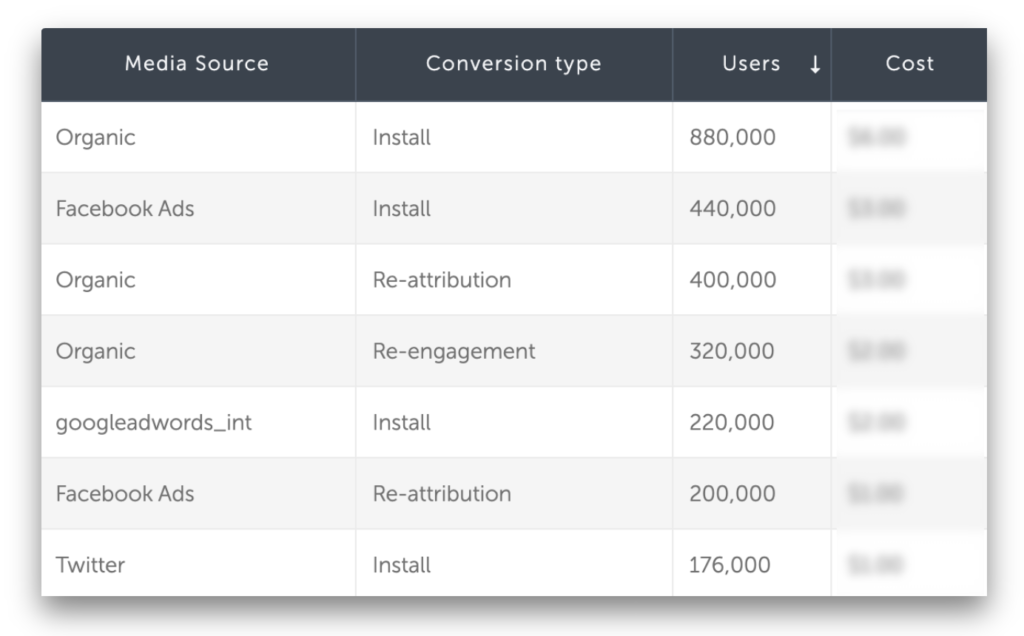
Маркетологи абсолютно любой вертикали и бизнеса могут извлечь пользу из отчетов по когортам, содержащих большое число группировок и KPI. Независимо от того, проверяете ли вы показатели вашей рекламной кампании за прошедшие выходные, или измеряете удержание пользователей, когортные отчеты от AppsFlyer дадут вам всю необходимую информацию.
Но что, если вы хотите посмотреть, как работает конкретный KPI в динамике?
С новым KPI “Attribution Time view” (то, что на дэшбордах AppsFlyer называется “тип тренда”- trend type), пользователи группируются по дате конверсии. Это позволяет оценить показатели кампании с течением времени и соотнести KPI с временем конверсии.
Вот пример:
Рекламодатель хочет сравнить показатели двух email-кампаний по ретаргетингу. Имейлы рассылаются по понедельникам и пятницам. Для того, чтобы проанализировать показатели этих кампаний на третий день, рекламодатель выбирает “показать график” на день 3, который позволяет ему увидеть доходы на этот день, а также показатели кампаний в динамике (см. изображение ниже).
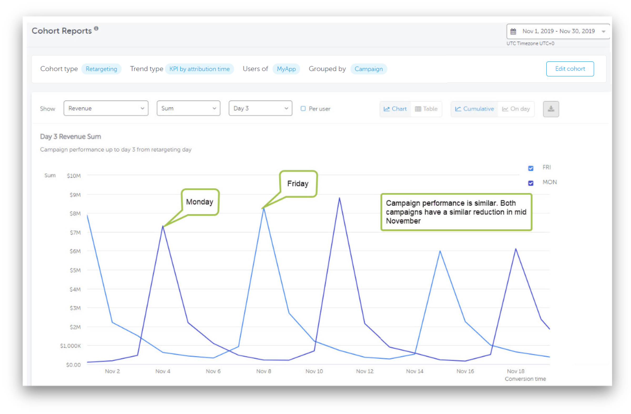
Согласно результатам, “пятничная” кампания взяла хороший разбег, но вскоре показатели обеих кампаний сравнялись, а к концу месяца обе кампании синхронно пошли на убыль.
Возможность увидеть показатели кампании в динамике позволяет получить новые инсайты и оптимизировать кампании исходя из конкретных KPI.
Следите за нашими обновлениями!