
Getting the right insights from your data with cohort analysis


There’s a common misconception that analyzing data at the highest level with the widest scope will provide the most extensive overview.
In reality, the opposite is true; data can be deceiving if it’s too broad.
The correct dimensions, slicing-and-dicing and aligning data correctly is what helps to see what’s working vs. what isn’t. Most importantly, perhaps, looking at the data in the right context is what matters most.
Clearing the noise
Context can be really complex to isolate, and context can mean many different things simultaneously.
One of the first things you learn in statistics class is that data can never determine causation, only correlation. And when it comes to correlation, you need to clear as much of the surrounding noise up as you can to prove a strong one. Data can never be completely clean of noise, but choosing filters that weed out most of it can give you stronger insights.
Here’s a real life example of “apples to apples.”
The goal: to compare family consumption habits of a dozen apples. We’ll determine that a “family” has to be a minimum of 4 people, and we’re comparing the consumption of an identically-sized purchase (a dozen):
- Family A buys a dozen apples on Sunday
- Family B buys a dozen apples on Wednesday
Apples to apples: Consumption habits in families of 4+ over time
When looking at the data ungrouped, it looks like Saturday was a peak consumption day, but otherwise, it’s hard to understand the data.
When we group the data by day of purchase, the trends are easy to see:
- Family A consumes apples slowly but at a fairly steady pace, but seems to have tired of apples by Day 3, with the consumption leveling out.
- Family B, on the other hand, was initially unexcited by their apple purchase, but spiked in consumption on Day 3 and Day 4 (maybe they found an excellent apple pie recipe?).
Bringing it back to the ad tech world, let’s reexamine the ARPU example from before.
It’s not enough to just compare one day’s ARPU to the next. We need to account for all the noise and filter it out: compare ARPU on similar days of the week, compare the number of users, activity, and whether or not there was a promotion or offer that could have driven more purchases.
When analyzing any KPIs, you want to make sure you’re comparing your data side-by-side with parallel data; comparing apples to apples.
Cohort to the rescue
When it comes to holding KPIs up side-by-side and assessing strategy success, cohort analysis is the tool you need.
Cohort analysis: Grouping together users with common characteristics to measure specific KPIs for these groups over different time frames.
Cohort isn’t just about analyzing KPIs. By uncovering hidden trends, cohort analysis provides the insights you need to optimize live campaigns and make real-time changes that can boost engagement and revenue.
Getting started with cohort
Cohort analysis may seem a bit daunting at first, but with a few simple steps, you can become a master in no time.
Setting up the query
First and foremost, you must establish what it is you’re interested in finding out. Defining your KPIs and success metrics will steer you in the right direction.
Are you measuring campaigns side-by-side to compare media sources? Or perhaps measuring the success of the same campaign across different regions? And how do you define success, anyway?
As soon as you have solid ideas about which question you’re asking and the metrics you’ll need to answer it, you’re halfway done.
Here’s a handy formula for cohort analysis questions:
Group users with similar characteristics to compare the behavior and metrics over a specific time-frame.
Examples of filters and groupings you can choose in Cohort analysis
The characteristics are the dimension by which you will be measuring your outcome. The KPIs are the actual metric you’ll be analyzing, and the timeframe will set the window for the measurement.
Let’s take an example in which we’re trying to assess the success of a certain campaign across different countries.
We want to look at user behavior on the day they installed the app, the day after the initial install, and several days later.
By aligning the days of install, we can analyze user behavior and interaction with the app by leveling the playing field. Aligning this metric for all users effectively compares apples to apples.
When defining the Cohort we want to examine in the dashboard, we’d choose the relevant app. In the example below, we’re going to group the cohort by country, and select the week of April 1 to April 7, 2019. We’ll set the minimum cohort size to 10 users. We’ll add a filter, for the correct campaign: the spring_sale_april campaign. This is what the selection will look like:
When we’re ready to go, we hit the Apply button to run the query.
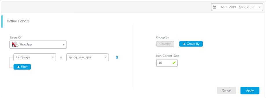
Setting up your cohort grouping, filters and dimensions in the AppsFlyer dashboard
Get the latest marketing news and expert insights delivered to your inbox
Analyzing the results
The view of our data will be determined by the pre-defined in-app events. In this example, we’ll look at two different pre-defined metrics: average sessions per user and average revenue per user.
When looking at the average number of sessions per user, this is what we see:
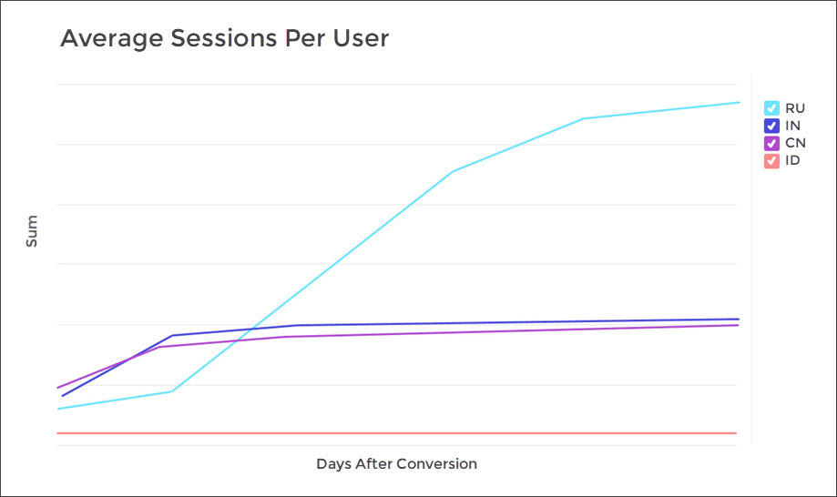
Russian users are highly engaged with the app, but is this the whole story?
At first glance, the Spring campaign seems to be performing exceptionally well in Russia (RU) and very poorly in Indonesia (ID).
Looking at the table view of the data, we can see that there is minor incremental growth in India (IN) and China (CN), with a big spike in average sessions per user in Russia on day 30. It’s important to note that this data is cumulative by default.
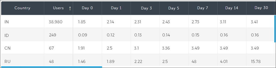
Table-view breakdown of average sessions per user, grouped by country. Day 0 is install day
But this data isn’t giving us the full picture. We can see that there is high engagement in Russia, compared to other countries, that continues to climb over time. Does that mean that the campaign was most successful in Russia?
Every story has (at least) two sides
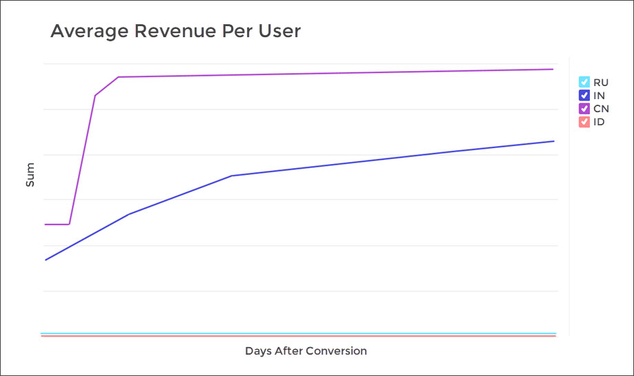
Hardly. If we switch the data view to average revenue per user, we’ll see a whole different story: while the Russian users are active in the campaign, they’re not spending any money. The Chinese users, however, are averaging a high spend per visit.
We can conclude, then, that there is room to optimize the campaign for the Russian market and encourage them to complete purchases (such as a special offer, coupon or sale). Since Chinese user spending plateaus around day 4, we can schedule a retargeting campaign around that time. Indian users are showing a steady incline in spend, which is exactly what we’re looking for.
Another interesting insight we can gain from these two cohort analyses, is the odd behavior of the Indonesian users. While there are a decent amount of installs (249), there is practically no app launch and no purchases at all. This may indicate fraud, and requires a deeper analysis via the Protect360 dashboard.
Your insights are waiting
Now that we’ve covered the basics of cohort analysis, making sense of the masses of data coming into your dashboard is a bit less daunting. Checkout Cohort’s sister report, Retention, for similar logic on analyzing churn level for your apps.