How important is an app icon for apps?
App icons are crucial for discoverability, acquisition, and user engagement. They can indicate your app’s purpose, build emotional connections, and help users quickly find your app on their device.
Try searching for
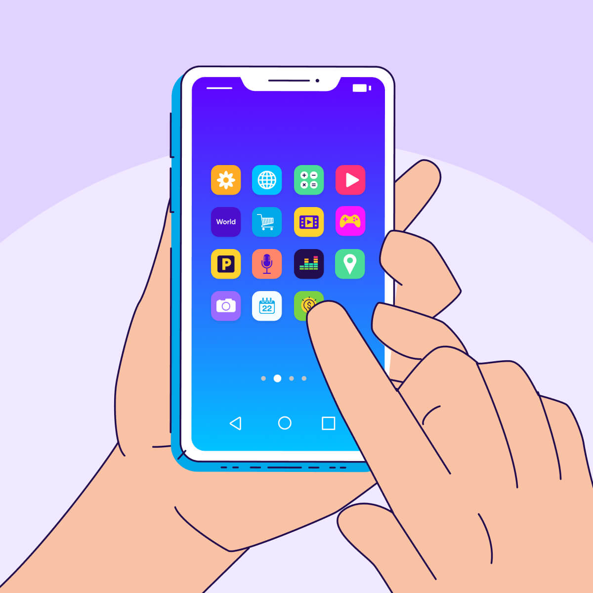
What comes to mind when you think of your favorite mobile app? Many people would say the app icon.
It may be small, but your app icon is the “face” of your app — it’s what people see in the app store search results or on their home screen. And you only get one chance to make a good first impression. That tiny package of lines, colors, and symbols can make all the difference in convincing someone to download or open your app.
So how can you pack the most punch in such a small space? Let’s dig into app icon design best practices.
Let’s clear up a common misconception: An app icon is not a logo. A logo represents your brand’s identity across multiple platforms, mediums, and touchpoints. Think Nike’s Swoosh or Apple’s… apple. Meanwhile, an app icon is only for one product — your mobile application.
While it’s possible to incorporate your company logo into your app icon, often the two look very different. Let’s say your company has multiple mobile game apps. Each game will have its unique app icon design, distinct from your organization’s logo.
App icons serve as visual anchors for mobile apps, appearing in app store listings and device home screens to help users find and recognize your app.
App icons are small, but mighty. Here’s why:
If all this sounds like a big ask of a tiny square, don’t worry — we’ve got all the tips you need to nail your icon design.
Ready to create an icon that will make your app stand out from the crowd? You have a few options available to you.
The other option — budget permitting — is to bring in the professionals. A good designer will talk to you about exactly what your icon needs to convey, and craft something totally original yet bang on brand. Given how hard your app icon needs to work, this expert support could be well worth the investment.
Whatever route you choose, you’ll need to make sure your creation meets the design standards for the major app stores. Read on to learn more…
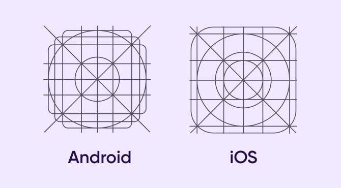
While your app icon design should stand out, you must adhere to a few rules when submitting it to the app stores. While both the Apple App Store and Google Play Store demand app icons be square-shaped, they have different specifications, so keep the developer guidelines in mind when creating the assets.
Follow Apple’s Human Interface Guidelines when designing app icons for the iOS ecosystem. Your app icon should work well in multiple sizes to suit various devices, for example:
The good news is, you only need to submit one 1024 × 1024px PNG file, and the platform will automatically resize the asset to fit various devices and sub-menus.
Apple app icons must be in PNG format and support sRGB (for color) and Grey Gamma 2.2 (for grayscale). Layers, transparency, and exact shape vary by platform, so be sure to check the full guidelines before you start.
Apple also offers additional guidelines, like keeping your app icon simple and easily recognizable on all platforms. Avoid using a complex background, flatten the image (in other words, no transparency) and only include text if it’s an essential part of the brand identity. Lastly, don’t put photos, screenshots, or interface elements in the graphic.
Google also has detailed specifications for app icon design. Here are some key points to keep in mind:
Use the entire asset space (512 × 512px) as the background, and the keylines (set at 384 × 384px) to position logos, icons, or graphic elements. Don’t add a drop shadow to the design because the platform will add it once you upload the file. However, you can add shadows to graphic elements within the border of the app icon.
Also, avoid using promotional or branding badges in the artwork since they often don’t scale well.
Knowing the specs is essential. But everyone has the same square to work with — how do you create an app icon that represents your brand and stands out in the crowded marketplace? Here are some tried-and-true best practices to follow:
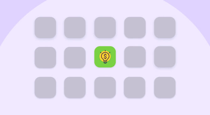
Your app icon must stand out from millions of apps in the app store — especially among your competitors in relevant search results. Besides driving downloads, it should help users easily find your app on their home screens so they’ll open and use it frequently.
It’s best not go too wild, though — your app icon still needs to fit with your brand and give users a clue as to what it does.
Simplicity, when done right, can help you achieve instant recognition. Think of brands like Target, Spotify, or YouTube, whose app icons contain just a couple of vibrant colors and simple shapes.
Taking out distracting elements helps the main design pop even more. Clean, simple designs also scale better across platforms and devices — and they’re better from an accessibility perspective too.
Top tips include removing background patterns, using gradient sparingly, and avoiding text and images (they don’t work well in such a small space).
This relates to the previous two points. It’s a fine balance between creating an original design, and ensuring users can:
Analyze competitor apps to see what elements they use to build a connection with users. Then, see which of these you could incorporate while putting your own twist on it.
This one is a bit more technical, but it’s crucial to making your app icon easy on the eye. Your icon may occupy a tiny space, but every element of it needs to be balanced and correctly aligned. Otherwise, it’s jarring and can put users off.
This is why designers often work on a grid pattern, to ensure everything is perfectly positioned. If you haven’t had your icon designed by a professional, it’s a good idea to seek feedback from some expert eyes.
Every operating system (OS) has unique design principles to guide all user interactions. An app icon that fits right in with iOS devices may stick out like a sore thumb on Android.
You should use the same design elements (like symbol and color) on all your app icons to enhance brand recognition. But you may need to apply slightly different treatments for each platform’s assets to ensure that the final design fits in with the overall user experience.
Different devices display app icons in various sizes. Since most platforms use raster graphics, which don’t scale as well as vector images, you should test and preview your icon in every required size before submission. Keeping your app icon design simple can help preserve legibility across platforms and devices.
It’s also worth testing your design against the most popular OS wallpapers to ensure your app icon doesn’t disappear into the background. To prevent this from happening, avoid transparency and consider using a contrasting border.
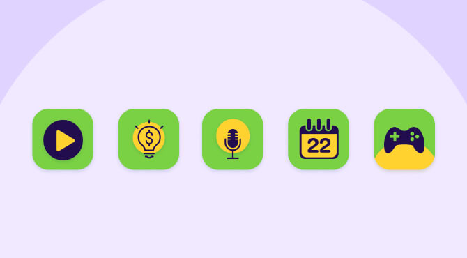
An app icon must not only communicate what your app does, but also represent your brand. It should be consistent with your brand’s image and all other touchpoints to deliver a coherent experience.
If your brand offers multiple apps (different games, for example), consider having a “throughline” (or design language) that ties all your app icons together. That might mean using a similar color palette, specific symbols or graphics, or a consistent stylistic treatment to create a shared “vibe”.
Even the best designer can’t conjure the perfect app icon out of thin air. Getting user feedback early and often is the key to nailing your design and evolving it to meet shifting consumer trends.
Run focus groups and A/B tests to evaluate options (more on this below), or try Google Experiments for Android designs.
If testing shows your app icon is no longer cutting it, don’t worry. Ongoing improvement is critical for keeping up with market expectations.
Look at leading brands to gain insights into general design trends, and keep an eye on competitors to see what direction your specific industry is heading. An app icon refresh can help your brand stay current and signal to users that you’re committed to optimizing their experience.
For example, this video shows how Google’s suite of app icons have evolved over the past decade to present a more consistent and contemporary feel.
Or consider Instagram, which has gradually made its app icon simpler and brighter — helping it stand out on users’ busy home screens, while staying connected to its core purpose (photos, of course!).
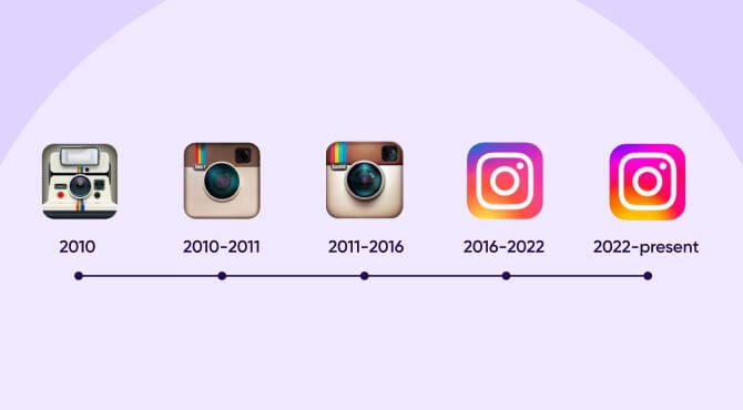
Following the guidance above will set your app icon on the path to success. Just be sure to avoid these common pitfalls:
So you’ve followed the guidelines, met the design specs, and created a few icons you think really showcase your app. But don’t just pick one based on gut feel — you need hard data to help you identify the best option. That’s where A/B testing comes in.
A/B testing lets you show different variants of your app to different audiences, so you can see which gets the best response (like click-throughs or downloads). For example, you can run a Facebook campaign where users are randomly shown one of two designs.
Be sure to include a big enough sample size for meaningful results, and ensure you’re testing with your target audience. And it’s best to focus on one design element at a time — for example, experimenting with a stronger background color or a cleaner font, rather than a full-scale redesign.
Once you analyze the results, you can take steps to optimize your icon for maximum engagement.
App icons are crucial for discoverability, acquisition, and user engagement. They can indicate your app’s purpose, build emotional connections, and help users quickly find your app on their device.
Not necessarily. While you can incorporate elements of your logo, app icons are specific to individual products and should represent the app’s function rather than just the company brand.
Effective app icons are unique, simple, recognizable, and aligned with your brand identity. They should also be designed to work across multiple sizes and backgrounds.
For Apple, submit a 1024x1024px PNG file. For Google Play, use a 512x512px PNG file. Both platforms have specific guidelines for color space, file size, and design elements. Clean, simple designs that scale easily are most effective.
Avoid making icons too bland, too busy, or confusing. Ensure your design is accessible, and culturally appropriate if targeting an international audience.