App store screenshots: Optimize your visual assets to attract users
By Einav Mor-Samuels
The human brain is hardwired for visual content. Images help us consume information faster, understand more, and remember it later.
That’s why images shouldn’t be an afterthought in your app store optimization (ASO). With users spending just 7 seconds on a product page, app store screenshots can stop the scroll and get your message across in milliseconds.
Research suggests that users read just 20% of the text during their visit on a page. From eye-tracking and heatmap studies, we know that images draw users’ attention. And, we also know that images with text boosts retention by up to 89% — keeping your app top of mind.
Here’s the deal with app store screenshots — they aren’t just simple screenshots of your product. They are professionally designed, custom graphics with the power to drive downloads.
In this post, we’ll walk you through how to design an app screenshot, requirements for Apple and Google, and best practices for success.
Why are app store screenshots important for ASO?
While they don’t affect your rankings, app store screenshots can make or break a conversion decision for someone viewing your app. Here’s why:
They send users to your product page. App screenshots appear in search results with your app title and subtitle. In a long list of competitors, they’re one of the best ways to entice a reader to even open your product page in the first place.
They let users preview your product. Beyond app descriptions, users want to visualize what your product interface will look and feel like. App store screenshots let you preview this information in just a few seconds.
They convey your brand. In the white space and conformity of app store listings, this is your primary space to display visual branding including color, typography, and images.
They connect to users. When users can see themselves in the graphics through lifestyle photos, illustrations, or use cases — they’re more likely to try your product.
What makes a good app store screenshot?
The best app store screenshots are eye-catching, clean, and actually show the app in use.
Your screenshots need to balance simple design with content. Remember that your image will be tiny on a user’s phone, so it can’t be too cluttered or contain small text outside of the interface.
Many of the most successful app screenshots are simple — they put a screenshot in a device frame and place it against a solid background with one line of copy.
Take TikTok and YouTube, for example. Both keep it simple by placing screenshots on a white background with simple black text. Others use lifestyle photography or illustrations while keeping the app example front and center.
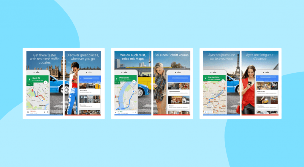
Another successful design approach that many developers use is creating a landscape design that’s broken up across multiple screens — to make a larger image effect.
Examples of apps using this are ESPN, Twitch, Marvel Unlimited, and Planta. This can have a scroll-stopping visual effect; just remember that each individual screen must still show the app in use and be able to stand alone.
App store screenshots requirements: guidelines and sizes
As with all ASO efforts, you need to design your listing to align with Apple and Google’s app store requirements for success.
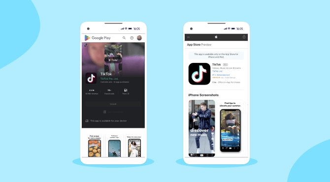
Apple Store app screenshot requirements
The Apple Store allows up to 10 screenshots for each product listing, which can be portrait or landscape, with one to three screenshots appearing in your preview depending on the orientation. It’s in your best interest to use all 10 to show off as much as you can about your app.
The most important thing to know about screenshots on Apple is that they require each screenshot to actually show the app in use. This is slightly more restrictive than the Google Play Store, which allows more flexibility for lifestyle and use case graphics.
Apple recommends communicating your app’s core essence and functionality in your first screenshot and to focus on a main benefit or feature in each subsequent screenshot. If you support Dark Mode, consider including a screenshot to complement this mode.
Apple App Store requirements at a glance are:
Minimum of 1 screenshot, maximum of 10
Must be in PNG, JPEG, or video format
Must be in 72 DPI resolution without transparency
If you use a video, it will appear in the first frame and autoplay
Must conform to exact pixel size specifications for devices you support including various iPhones and iPads, Macs, Apple TVs, and Apple Watches
Google Play Store app screenshot requirements
In the Google Play Store, app screenshots don’t always appear in search results — only when you search by the brand name.
On the store listing page, they’ll appear directly below the key app information including app title, icon, and rating. You can add up to eight screenshots in your store listing and will need to upload custom images for each device type you support.
According to Google, screenshots should convey the look, feel, capabilities, and experience of your app. You can do this through a lifestyle shot of the app in use or through screenshots showing your top features. Copy and taglines shouldn’t represent more than 20% of an image, and shouldn’t include direct calls to action or performance keywords like “top” or “#1.”
Google Play Store requirements at a glance are:
Minimum of 4 screenshots, maximum of 8
Must be JPEG or 24-bit PNG format with no alpha
Must be 320 to 3840 pixels with an 8-MB maximum file size
Must be in 16:9 or 9:16 aspect ratio
The maximum dimension of the screenshot can’t exceed 2x the minimum dimension
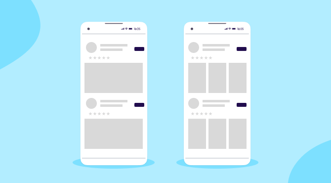
One benefit within the Google Play Store is a feature that recommends apps and games in search with screenshots. While you can’t control when your app is selected, you can increase your chances by closely following Google’s best practices.
For instance, upload screenshots with a minimum 1920 by 1080 pixels, show the actual in-app or in-game experience, and avoid showing people interacting with the device, like a finger tapping.
App Store Optimization (ASO) checklist
Thanks for your download!
App store screenshots best practices, tips, insights, and trends
Not sure where to start? Follow these seven proven best practices to create app store visuals your audience will love.
1 – Perform competitive research
To get inspiration, check out what type of screenshots your competitors are using. While you can’t display app comparisons in your app listing, you can perform research to identify and highlight what makes your app unique and different.
Remember that users will look at several similar apps at a time. What will make yours stand out?
Make a whiteboard to pin screenshots from at least three competitor apps side-by-side. First, analyze the design and ask yourself which one draws your eye and why?
Look closer at the value propositions communicated in each screenshot and the accompanying text. Can you offer something different or better?
Read app reviews to find out user frustrations with your competitor apps. Call attention to your differentiators in your screenshots.
guide
How to ASO like a pro: App store optimization guide
2 – Find the best screenshot order
Only 9% of app users scroll through screenshots, which means that your first three (or one for landscape) are the only screenshots most users will see. This is slightly higher for games, with 17% scrolling through.
To make the most of this, communicate your main purpose or benefit in the first image and save new features for the end.
Make sure that the text is large enough for readers to view them without having to make their screenshots bigger (since most don’t), and keep text to just four or five words per line.
3 – Tell a story
Your screenshots should flow together cohesively and should be able to tell a clear story. Use your first screen to state your main benefit and then use your following screens to state how your app achieves it.
If your app is a new concept to the user, storytelling is a great approach to quickly show how something works. For instance, the Wag! app starts with a core benefit (“Any day, any time pet care”) then uses the following screens to show the basic steps to booking a dog walker.
One way to make your app screenshots into a narrative is through design that crosses screenshots. You don’t have to use this approach, however. You can also simply make sure that the graphics and messaging work together across individual screenshots.
4 – Portrait vs. landscape
There’s no right or wrong answer for whether to use portrait or landscape screenshots. Use the orientation your app is primarily designed for. Portrait is the more popular choice since many apps are designed for portrait use, but using a landscape image can make you stand out (take a look at Hulu, for example).
Many games choose to use a landscape video for their first screenshot image. If you do use landscape, just remember that it takes up more real estate in your preview space and fewer users will see your second and third screens. So be sure to make that video count.
5 – Use A/B testing
Choosing the best app screenshot design isn’t complete guesswork. You can find out which visuals drive more conversions with A/B testing on the app stores.
Both Apple and Google have a way to A/B test different versions of app listings, including screenshots. We highly recommend testing different screenshots and also different orders of screenshots to see which performs best.
6 – Localize your app screenshots
As with all app metadata, you’ll want to localize your app screenshots for different global markets. If your app is available in different languages or if you customize your app listing for different languages, make sure to include screenshots with those languages or dialects.
More than that, you’ll want to test and analyze your visual designs as each market has different preferences. If you use photography or illustrations, make sure that they’re representative of and appropriate for that region’s culture.
7 – Customize your screenshots and dimensions for each store
One important thing to remember is that the users for the Apple App Store and Google Play Store aren’t the same. They have different preferences and the same approach may not work for both stores.
Perform competitive and A/B research for each store and be prepared to customize your approach based on what you find.
Get the latest marketing news and expert insights delivered to your inbox
Bonus: App store video & icon requirements – guidelines and sizes
Beyond screenshots, there are two other important visuals in your store listing: the app icon and videos.
App store videos
Both Apple and Google allow you to upload a video along with screenshots.
Videos are a great way to showcase how an app or game works and your core features and benefits. They appear first in order of your screenshots by default, so your video needs to be top-notch quality to justify the placement.
Keep in mind that videos autoplay without sound, so make sure your message isn’t reliant on audio.
On Google, videos must be hosted on YouTube. Adjust your setting to make the video public or unlisted, disable ads, and make it embeddable. Take into consideration that the first 30 seconds of a video autoplay. While you can make your video longer, simpler is better.
App store icons
App icons should use a clean, crisp design that will stand out. Embrace simplicity and avoid small graphic details that will be lost in an icon’s tiny size. If you use text, limit it to a short brand name or word mark.
Use keyline grids to center your artwork and make it versatile for small nuances in device requirements. App icons should be designed on a full bleed and in a square format.
Apple and Google will both apply their signature app formatting (rounded corners and a drop shadow) after you upload it.
Apple App Store
Google Play Store
File format
PNG
32-bit PNG (with alpha)
Dimensions
1024 by 1024 pixels. You can also allow Apple to scale your icon down or can upload custom versions for each platform.
512 by 512 pixels
Other requirements
Display P3 (wide-gamut color), sRGB, Gray Gamma 2.2 (grayscale). The layers, transparency, and corner radius can vary by platform.
Max file size of 1024KB
What to avoid
– Text, unless it’s an essential part of your brand – Photography
– Text conveying pricing – Ranking or badges – Google Play categories
Key takeaways
No matter how users landed on your app listing, an eye-catching app screenshot can set you apart and drive downloads. Keep these principles in mind:
Remember, you only have seven seconds to make an impression. Don’t waste any time; put your core benefit in the first screenshot.
Your app store visuals should balance beautiful design with information — showcase what you have to offer.
App store listings use a lot of white space and conformity by design. Use visuals to make your app pop and convey your branding.
App screenshots are very small on a mobile screen, so keep them clear of visual clutter and too much text.
Analyze everything! Research competitors and test versions to find out what makes users take action.
FAQs
How do app store screenshots contribute to app store optimization (ASO)?
App store screenshots can significantly influence user engagement and conversion by piquing interest in search results, providing a preview of your app, showcasing brand identity, and creating a visual connection with potential users.
Can I use just any image for my app store screenshots?
No, app store screenshots must be professionally designed and show the actual app in use. Apple’s guidelines are stringent and Google Play has its own set of requirements, including format, dimension, and aspect ratio constraints.
What are the key differences between the Apple App Store and Google Play Store screenshot requirements?
Apple allows up to 10 screenshots, with specific guidelines on format (PNG, JPEG, or video) and resolution. Google Play requires four to eight screenshots, in JPEG or PNG format with aspect ratio stipulations. Whereas Apple insists your app is shown in use, Google allows lifestyle images to convey your app experience.
Should I design my app store screenshots differently for each platform?
Yes. Not only do the stores have different requirements, user preferences also vary between the Apple App Store and Google Play Store. So, it’s best to perform platform-specific competitive research and A/B testing to tailor screenshots for each audience.
How many app store screenshots should I use and in what order?
You should use the maximum number allowed by the platform – 10 for Apple, eight for Google Play – to showcase your app’s features. Place your core benefit in the first screenshot and arrange the rest in a logical sequence that tells a story or highlights key features.