
The Ultimate Creative Optimization Masterclass


Part 1 – Creative optimization: 3 power moves to scale smarter
TL;DR
- Creative is now the single biggest driver of performance in UA – so keeping our top creatives performing at their peak is a priority.
- Having all your creatives grouped into one dashboard, grouped by similarity, saves huge amounts of time and money.
- Fatigue comes for all creatives in the end – but we can detect when an ad is about to run out of gas before it hits our budget, and take steps to supercharge it.
- No ad is universal – some flourish in one territory, but barely make a dent in another. Being able to compare cross-geo and cross-network performance on the fly leads to instant strategy upgrades.
- AppsFlyer’s Creative Optimization tool makes this possible in one centralized, customizable, powerful dashboard.
See how Creative Optimization can work for you
Creative performance is your growth lever. Don’t waste it juggling dashboards and guessing when ads burn out. With AppsFlyer’s Creative Optimization, you finally get one clear, actionable view. Book a demo now or speak to a member of the AppsFlyer team, and join me in scaling smarter.
Why your best creative isn’t enough anymore
All good things must come to an end, right? That thought might have been running through your head while you watched your best-performing ad run out of gas while you try to work out why it’s grinding to a halt.
Popping the hood is no easy feat either: messy dashboards, naming chaos, and cross-network blind spots all suck away your time and resources.
Creative is the single biggest driver of performance in user acquisition – that’s why we need to do everything we can to keep our top creatives at the peak of their powers. Yet for a lot of UA managers, managing multiple dashboards can be a juggling act that leads to guesswork when it comes to knowing when to refresh ads.
I’ve been testing a smarter way. A way that centralizes creative data, surfaces fatigue in real time, and compares performance across networks and geos: AppsFlyer’s Creative Optimization tool.
These three pillars have changed how I run campaigns, for the better. All good things must come to an end? Not just yet…
1. Centralization: all your creatives, one command center
Sometimes, running campaigns can feel like Avengers movies in the wrong order: you get the pieces, but not the cohesive picture. Meta, TikTok, Google… every platform has its own dashboard, metrics, and naming rules.
AppsFlyer flips this on its head. All creatives live in one unified dashboard. Installs, ROAS, CTR, CPI – you set the metrics, and the tool pulls everything in. No more channel-hopping.
Even better, it automatically groups creatives by what they are, not by the random file names we uploaded (something I think most of us are guilty of). Let’s say you run a variety of ads based upon the same piece of user-generated content. All variations of that ad across TikTok, Meta, and Google get grouped together automatically, and you finally see the whole creative family’s performance in one place.
No more messy naming conventions: AppsFlyer uses AI similarity matching to group assets automatically.
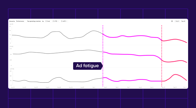
2. Fatigue detection: see decline before it hits you where it hurts
Every UA manager knows the heartbreak when your top creative suddenly loses its superpowers. CTR drops. CPI climbs. You keep spending, but returns shrink.
With AppsFlyer, you no longer have to worry about noticing fatigue late, because you see it coming. The dashboard measures creative age and performance patterns, highlighting when an ad is losing steam. A character-based video I ran was golden on launch, but AppsFlyer made sure I was aware the moment those high-performance metrics started to run out of power. Knowing about CTR drops and CPI rises before they really hit my budget meant I could give my designers the go-ahead to refresh early, rather than scrambling later.
Fatigue detection isn’t just a nice-to-have – it saves budgets. Refreshing at the right time means you maximize the lifespan of each creative without overinvesting in a dying asset.
I can also share the dashboard directly with my designers. We cut down on debates over why an ad no longer works, and get straight to the heart of the matter.
3. Geo and network comparisons: adapt your strategy in seconds
Creative performance is never universal: what crushes in the US might flop in Germany. A UGC video may shine on TikTok but stall on Meta. The problem? Most dashboards make cross-geo and cross-network comparisons a tangled nightmare.
AppsFlyer, on the other hand, makes it instant. You can easily switch views to see which creatives dominate by geo, network, or campaign. For one client, I spotted a creative that underperformed in the US but delivered great results in Germany and South Korea. Instead of pausing it, we doubled down regionally – and performance jumped.
We’re moving on from guesswork. With this dashboard, we can formulate data-backed regional strategies you can act on in seconds.

Key takeaways: empowering your entire workflow
With those three pillars in one place, you’re essentially powering up your entire workflow:
- All creatives at your fingertips – grouped, analyzed, and compared side by side
- Fatigue warnings show you which ads need refreshing, before you take the hit
- Geo splits highlight where to scale or cut
- Boost collaboration between designers, UA managers and growth teams by aligning with the same view
- Be smarter, faster – save hours every day, and act on insights in seconds
It’s not just about the amount of time you’ll save. It’s about faster pattern recognition. When everything is centralized, insights jump out at you. And when your creative team sees the same dashboard, you skip endless back-and-forth.
This is why I call it a UA command center. You’re no longer getting bogged down in channel silos – you’re running the whole creative game with total clarity and visibility.
Part 2 – See What Drives Ad Success: AI-Powered Creative Optimization
TL;DR
- No more guesswork: now we can understand which creative elements in your ad make it a success – or due for a refresh.
- AI-powered tagging allows for swift, seamless grouping and comparison of ads by different elements, hooks and conceptual themes.
- Easily see which ad groups truly deliver results: AppsFlyer’s Creative Optimization tool frees up time, resource and budget to scale smarter.
Element-level creative optimization
Every UA manager finds themselves staring at the same question time and again: why did this ad work?
Was it the ad’s humorous tone? The gameplay footage in the first three seconds? A catchy, chatty voiceover? Or something else entirely that you can’t necessarily spot just by glancing at the ad?
Creative teams and analysts pour tons of time and resources into trying to find the answer, drilling into each ad’s performance metrics. But rarely are we able to pinpoint the real reason for why each ad is returning those numbers – and guessing is not a strategy. The good news is that we can leave behind the mess of the guess. AppsFlyer’s Creative Optimization tool comes with AI tagging that automatically breaks down creatives into their building blocks – their DNA. We can then see exactly which elements drive performance.
Let’s take a look at three ways I’ve been able to enhance my creative strategy, and scale more winning ads.
1. AI-powered tagging
Sometimes, creative reporting can feel like detective work. Manual tagging, disconnected file names, messy folders – it’s slow, it’s error-prone, and it can bog you down.
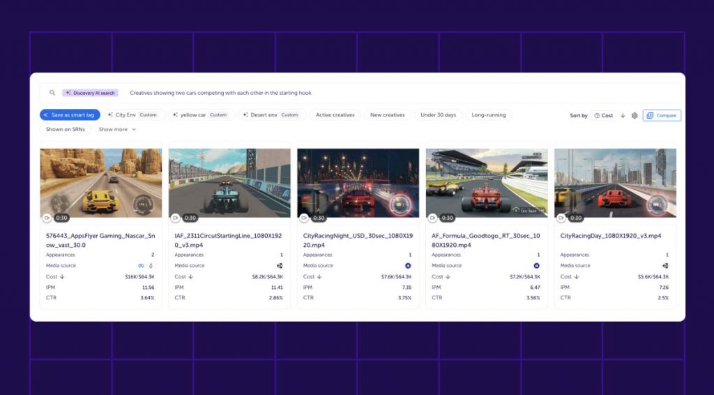
With AppsFlyer, every creative is automatically tagged by scenes, text,, and elements. It’s an AI-powered tool that takes care of all the busywork for you, freeing up your time and brainspace to focus on the winners. You can filter ads by whatever you want – gameplay vs computer-generated imagery (CGI), music vs voiceover, user-generated content (UGC)vs cinematic trailer – and instantly compare their results.
It’s like going from blurry X-rays to a crystal-clear MRI scan of your ad performance. Now, you can compare creative families – and see which versions deserve more of your precious ad spend.
2. Element-level insights
With automated tagging, AI essentially dissects your ads frame by frame – breaking it down to the most granular level. This lets you compare performance by elements, texts, tone, and all other variables that combine together to form the final creative.
Now, you can see your ads automatically grouped in a way that lets you measure performance on an element level. You can quickly filter to compare performance between contrasting elements, such as:
- Tone: playful/humorous vs serious/dramatic
- Content: UGC vs CGI
- Timing: gameplay shown in the opening seconds vs shown towards the end
- Design: compare performance based on different characters, texts or other visuals
For example, I quickly filtered two groups of ads that featured different characters from a mobile game. Within seconds, I had a clean breakdown of CTR, CPI, and ROAS for ads that featured each character
Moving away from animation, I can also easily pull up creatives that show real people and compare performance on those. Live scenes, UGC visuals, specific text CTAs – whatever element of the ad you want to compare, it’s all at your fingertips.
This means your creative team doesn’t just see “ad A works better than ad B.” They see why. Was it the shorter runtime? The opening? The gameplay reveal? By sharing these insights directly with my designers, we save masses of time and have the assurance that our next round of creatives is built on proven winning elements – not gut feel.
3. Building smarter ads, faster
Once you see the DNA of your winning ads, you stop wasting budget on the wrong formats.
If your three best-performing ads all use humorous UGC, then double down on that creative with your designers. Cut out an underperforming group of ads and factor those elements into your future planning. And when you spot that a creative drives a much higher ROAS in Germany than it does in the US, for example – adjust your strategy regionally and reap the rewards.
This is the power of AI tagging to automatically break down your ads. You finally learn why your best ads work, and why some flop. By seeing the DNA behind the creatives, you’ll be able to make smarter decisions, faster.
It’s about turning performance data into creative briefs that work. Designers finally know what matters. UA managers finally know where to scale.
Key takeaways: AI-powered tagging to find winning ads
These three features of AppsFlyer’s Creative Optimization tool have allowed me to find winning ads more easily, by breaking down each ad to its individual building blocks. Leave guesswork behind:
- Use AI-powered tagging to see every ad dissected by element: scenes, text, characters, tone and more.
- Compare CTR, CPI, ROAS across those tags in seconds, and give access to your design team so that they can iterate faster and build smarter ads immediately.
- Budget smarter by seeing which ad elements perform best for specific audiences and geos. Scale proven creatives and cut dead weight to ensure you get the maximum return on your spend.
See how Creative Optimization can work for you
Your creative strategy shouldn’t run on gut feel and guesswork. With AppsFlyer’s Creative Optimization, you finally see why ads succeed, down to the tiniest part of their creative DNA – and use that knowledge to scale smarter. Book a demo now or speak to a member of the AppsFlyer team today.