


The mobile-first design essentials for 2022


The first time the mobile-first design approach was talked about was way back in 2010, almost 12 years ago.
The CEO of Google at the time, Eric Schmidt, said Google would be pivoting to this design approach. Now, in 2022, it’s estimated that 7 billion (yes, with a “B’”) people are smartphone users. These 7 billion are the mobile market proof that Schmidt knew what was up when he said, “mobile will ultimately be the way you provision most of your services.”
Today, developers should be embracing the mobile-first design approach if they want to have a piece of that 7 billion (and growing) digital consuming market.
What is mobile-first design?

Traditionally, developers would scale down from desktop to mobile, but nowadays, designing with mobile top of mind means starting your product from the mobile end first and then expanding its features to build a desktop or tablet version.
The mobile-first design approach aims to prototype and create better user experiences by starting the design process from the smallest of screens, which helps ensure that the user’s experience will be seamless on any device.
Mobile-first: Web or app?
In 2022, companies need both a mobile web presence and a mobile app, and with 57% of consumers willing to ditch a company with a poor mobile experience, the necessity of the mobile-first philosophy has never been clearer.
Nike is a brand that highlights the long-term business benefits of having both a mobile-first website and app. The site reaches Nike’s broad global audience with a seamless user experience. And to retain those users, the site will entice users to install the app onto their device for even more benefits, like exclusive offers and rewards.
How your users feel about their mobile web experiences can determine whether or not they will take the next step and install your mobile apps.
Today, in catering to 7-billion digital consumers, companies must consider mobile-first web and app design to capture, retain, and monetize those users.
Why mobile-first? 2 key advantages to mobile-first design
Embracing mobile-first design means that you are assuring your users that no matter the platform, they can expect a responsive UX. Approaching design this way simplifies and compresses your information into manageable chunks — but there are even more and better advantages to taking this approach:
- Increased engagement. Conversion rates “on mobile devices have grown 64% compared to the average conversion on desktops.”
- Better retention. As previously discussed, almost 66% of enterprises identify as mobile-first, with a growing number of enterprise-sized brands seeing mobile as a highly strategic acquisition and retention channel.
It has become abundantly clear that to engage and retain digital consumers, the mobile-first philosophy is where it’s at.
How did we get here? A brief history of mobile-first design
By the time the millennium rolled around, designing a site to work on different screen sizes was fast becoming the norm. However, to do this successfully, developers had to use a lot of tricks — that is, until the great paradigm shift happened in 2010.
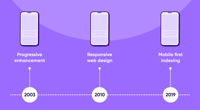
Here’s a brief overview and timeline of how it all happened:
Progressive enhancement
Progressive enhancement is a web design strategy that emphasizes content first. This allows anyone to access the basic content and functionality of a page. At the same time, users with better browser features or faster internet speeds receive the enhanced version automatically.
In 2003, developers Steve Champeon and Nick Finck gave a presentation called Inclusive Web Design for the Future because engineers and developers were already looking for ways to provide better overall accessibility, content availability, and mobile browser capabilities. They called this new approach to web development progressive enhancement.
Responsive web design (RWD)
A responsive design means that your design works beautifully on all devices, including desktops, smartphones, and tablets.
The same year Eric Schmidt initiated the great paradigm shift, Ethan Marcotte published a blog post titled Responsive Web Design. Both of these ultimately set off a chain of events culminating in mobile-first being the design priority in 2022, where “more than ever, we’re designing work meant to be viewed along a gradient of different experiences.”
Responsive design looks like readers have perfect readability and the same if not extremely similar user experiences, regardless of the device.
Get the latest marketing news and expert insights delivered to your inbox
Mobile-first indexing
On July 1, 2019, Google announced that “mobile-first indexing is enabled by default for all new websites.”
This meant that Google predominantly uses the mobile version of the content for indexing and ranking. Since most users access Google Search with a mobile device, Googlebot now primarily crawls and indexes pages with the smartphone agent.
So, 16 years after progressive enhancement was introduced and nine years after the great paradigm shift, Eric Schmidt’s declaration about a mobile-first future became a reality.
How to implement a mobile-first process
Let’s say you’re a developer working on a site for a popular clothing store chain. Mobile-first design means you understand your user and what they expect from a mobile site. For instance, your end-user is probably on their phone looking for store hours, location, or how to contact you.
Implementing this design strategy has you scaling up from the smallest to the largest dimension.

- Mobile: Lean content like store hours, location, and contact info prioritized — plus collapsible menus and widgets.
- Tablet→Desktop: Higher-fidelity visual elements, more high-definition photos, and more whitespace. Desktop sites will serve full-size imagery like ads and promotional materials (which on a mobile device is stripped and, in some cases, completely removed).
Mobile-first principles and best practices
The first step in implementing this design strategy is to know your users.
Once you understand what mobile end-users have come to expect from a mobile experience, web designers and app developers should keep in mind the following principles to be able to provide an optimal mobile-first web design:
- Prioritize content: For mobile-first design, content is king, and a lean approach to information architecture is paramount to the mobile experience.
- Intuitive navigation: Simply put, users have come to expect certain functionalities in certain places. When developing, think about things like where users expect to find functionality, like the menu or back buttons. If the user expects the menu button will be at the bottom left, intuit that design into each screen.
- Test on real devices: This goes without saying (but we said it anyway).
Key takeaways
Since the great paradigm shift, post-2010 web users across the globe have transitioned from desktop to mobile devices, and the trend seems to be growing exponentially. Therefore, it stands to reason that, from designers to developers, the mobile audience is the priority.
Here are the five things you need to keep in mind when it comes to mobile-first design in 2022:
- The mobile-first philosophy is starting product design from the mobile end first and then expanding its features to create a tablet or desktop version.
- Adhering to this design philosophy increases engagement and retention on your sites, and Google will defer to mobile versions of the content for indexing and ranking.
- Implementing this design strategy keeps users and their experiences at the front of developers’ minds.
- If content is king here, then intuitive navigation is queen.


