Why is mobile app UX important?
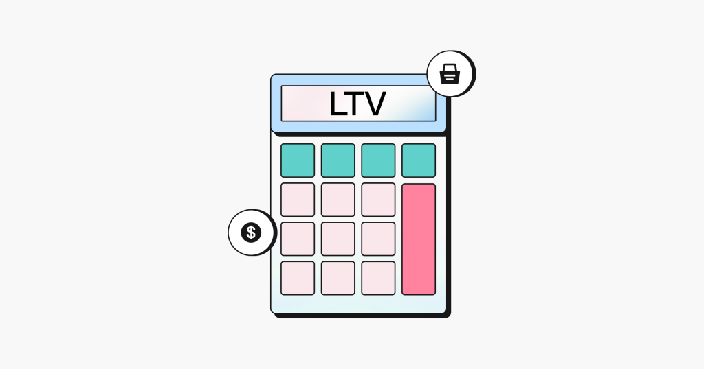
Mobile app UX (user experience) is critical because it directly impacts user retention and satisfaction. Making your app simple and enjoyable to use will keep users coming back, boosting your lifetime value.

Try searching for


People spend an average of four hours per day using apps on their smartphones. If you want one of those apps to be yours, you must consider your mobile app UX (user experience).
The most frequently-used apps are the ones that simplify our lives. According to Josh Clark, author of Tapworthy: Designing Great iPhone Apps, we tend to be in at least one of these three modes when using our mobile devices:
In these ‘micro-moments’, mobile users are goal-oriented and have limited time and bandwidth (often literally). They want streamlined interactions and expect immediate results.
UX is an essential aspect of any product strategy, but mobile app UX has some specific considerations, like space constraints and context awareness, for designing an experience that’s optimized to meet people where they are.
In this guide we’ll walk you through the what, why, and how of mobile app UX, and give you a robust set of best practices for designing and improving your own mobile app user experience.
Mobile app UX is the end-to-end experience and set of interactions users have with an app on handheld devices, including smartphones, tablets, and wearables.
Note that the more general term ‘mobile UX’ refers to both app and website design, and the two are often used interchangeably.
User experience and user interface (UI) design work hand-in-hand. UX is concerned with experience: the holistic journey of touchpoints in a product’s design. UI is concerned with interface: the design language and system of elements with which a user interacts.
For starters, almost three-quarters of internet users (that’s nearly 3.7 billion people) will access the web solely via their smartphones by 2025. And those users have high expectations of mobile experiences when it comes to speed, ease of use, and enjoyment.
Combine this with the fact that 38% of users are willing to download an app if they need it to make a purchase, but half will uninstall it after completing the transaction. In fact, half of all apps are uninstalled within 30 days!
And, to make things even more complicated, the average user only engages with five apps on a regular basis.
To maintain user attention and loyalty, your app’s UX must constantly prove its value. If your app genuinely solves a problem and is easy and enjoyable to use, it’s more likely to be sticky: in other words, you’ll retain more users and have higher numbers of active users. That boosts your lifetime value and powers growth.
In short, you should always look to simplify users’ lives, create more contextual experiences, or simply offer moments of enjoyable distraction. Focusing on these qualities can help move your UX design from good to great.
We’ve got plenty of tips below on how to improve your UX, but before we go any further, let’s take a minute to consider the fact that 70% of mobile users will abandon an app if it takes too long to load. And by ‘too long’, we mean about five seconds.
You could have the most beautifully designed app with the sharpest copy and the hottest features, but if performance is poor, no one will use it. The back end must be on point to optimize network performance and ensure the app renders on all devices, without draining the memory or battery. And it goes without saying that crashes are a huge no-no.

There are multiple differences between desktop and mobile app UX in a user’s context and environment. Let’s take a look at the main ones.
On a desktop, users are likely to have multiple tabs and apps open for multitasking, as well as a full-size keyboard, and a more stable and comfortable physical workspace. What’s more, they’re probably stationary and have steady lighting.
On a mobile device, however, users are likely to be focused on a single task that might have some urgency in the moment. In addition, they might be in transit, in an unfamiliar space, double tasking (think: coffee run, or picking up dry-cleaning), and might even have bandwidth or internet constraints.
Desktop users may be using one or more full-size, high-resolution displays that make it easy to see and scroll to reveal details or calls to action.
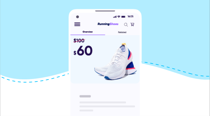
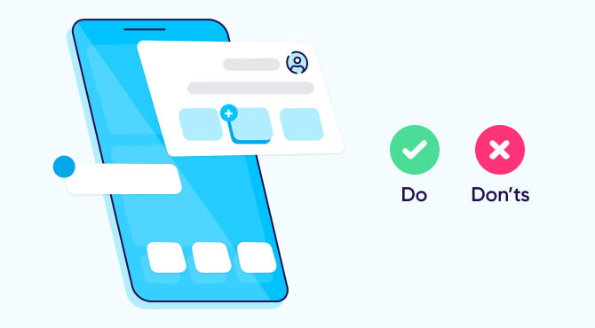
Mobile screens, however, are obviously constrained, so it’s critical to position important content and calls to action above the proverbial fold, and in places where they get the most attention.
Establishing a clear and comprehensive design language is essential to mobile app design, particularly when it comes to getting your users from one place to the next in the smoothest fashion.
Just like in the real world, patterns help cue people on what action they should take, even if it isn’t explicit.
While mobile interfaces rely heavily on these recognizable, universal visual patterns to signal common actions and features (for example, the hamburger menu, or a three-lined icon to indicate a collapsed menu), desktop is another story.
No one really messes with established mobile conventions like the ubiquitous hamburger menu mentioned above. However, on desktop, there’s a much wider variety of ways for designers to tackle UX.
Just take a look at Awwwards menu design inspiration gallery if you want to see some pretty out-there UX patterns.
With mobile overtaking desktop usage since 2014, and especially with Google’s recent emphasis on user experience and mobile-first indexing, designers have increasingly adapted their UX work to a mobile-first approach.
This means the design process is driven by a focus on the constraints of a user’s smallest device (which might be an Apple Watch or iPhone) and adapted upwards to larger screen sizes.
It also means providing a smooth experience between mobile web and native apps using both on-brand visual cues, and technology such as deep linking and deferred deep linking, to make sure users have an uninterrupted journey.
As a first step, product teams need to make an important decision about their development strategy, which we’ll explore in the next section.
To maximize reach, you’ll likely want to make your app available to both Apple and Android users. Each system has its own specific design guidelines that you’ll need to adhere to — Flat Design for iOS, and Material Design for Android — and there are also some UX differences you need to be aware of.
For example, there are differences in navigation: on iOS devices you can swipe to go back, whereas Android devices have a Back button in the bottom-of-screen navigation. Likewise, you can move around Android apps via a hamburger menu, whereas iOS has a tab bar for switching screens. Button design varies too, and the floating activity button is positioned differently.
All of these factors and more — from the shape of your app icon to the size of your tap zone — need to be considered at design stage, to give all your customers an equally amazing experience.
The mobile app design process is essentially the same as any user-centered design process, except that it involves an upfront decision about how the product will be developed.
Let’s dive into some important steps along the way:
1. Evaluate the development options and decide which one best aligns with your business objectives and your user’s needs. There are three options to choose from:
2. Create a user persona. Ideally you’ll base this on primary research, like interviews, surveys, and customer data and insights, alongside secondary market research. Focus on understanding your user’s needs: what challenges might they face while using your app, and what specific, actionable solutions can you offer to help them meet their goals?
3. Define the essential steps of the end-to-end user flow. Identify the key interactions at each touchpoint and prioritize the content and calls to action required to move the users through the experience efficiently.

4. Develop sketches into wireframes of individual screens, establishing a navigation system and information hierarchy. In the beginning, your wireframes should be simple, with the minimum amount of detail necessary to get useful feedback.
5. Connect the screens into prototypes that you can test with users. Prototypes help determine whether your steps are in the right order and if there are any gaps in your flow. They’re an effective tool for getting feedback throughout the design process. Test early and often!
6. Iterate, adding layers of detail as you receive feedback from your users and team. With each round of testing, you can layer on visual design elements and style, switch from lorem ipsum to real copy, and add more complex interactivity. You can even use augmented reality to enhance the experience, for example, showing how a product might look in different environments.
As a general rule of thumb, in mobile app UX, your focus should always be to make things easier.
The constraints of mobile can actually work to your advantage in distilling the essence of your product up the responsive ladder, forcing you to put only the most valuable content and interactions front and center.
So how can you reduce the clutter and sharpen the focus?
According to the industry experts at the Interaction Design Foundation, “a user’s comprehension is 50% less on a mobile device, which means that content, navigation, and visual design elements must be twice as intuitive as they are on a desktop.”

Good UX, like marketing, is grounded in deep customer insights. UX is not only responsible for enabling useful and usable functionality, but also for creating resonant brand experiences.
Marketers and UX designers must work hand in hand to ensure an app’s success: after all, both have the same goal of creating lasting engagement.
If you’re looking to better understand the baseline experience for your app, start with the UX design. Talk to your designer about the choices behind in-app user flows and paths. Also, see if they had a certain experience in mind for web-to-app journeys.
Powered with this knowledge you can then begin to dig into behavioral data and insights to examine your app’s performance.
Squaring KPIs like session depth, number of screens per visit, and in-app event completions against the UX design can reveal what’s helping or hindering users on their path to conversion and point to where they might be dropping off.
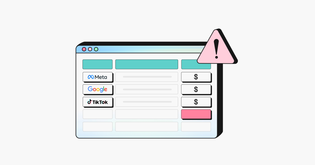
For example: serving up any offers or promotions that interrupt the user’s flow in the app might be one cause of abandonment. 46% of the time people had an interruptive mobile experience, driving them to declare they would not purchase from that brand in the future.
Marketers can work with UX designers to find the appropriate moments in the experience to reach users, with the right message at the right time, without distracting them from their goals.
An app’s UX holds the key to its successful market adoption.
When looking at an app’s K-factor, or word-of-mouth virality, for example, keep in mind that 89% of people are likely to recommend a brand after a positive experience on mobile.
Though an app’s moments of interaction might be small, their impact has the potential to be mighty.
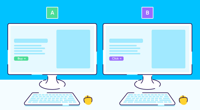
A/B testing — where you run two different options in parallel and compare responses — is a powerful tool in improving your UX design. Your designers may be bursting with great ideas, but UX is based on evidence, not personal preference. Every decision you take should make things easier for users.
For example, you can try moving the position of a call to action to see where it gets the most clicks. You can amend the copy on your welcome page, tweak your color palette, or even experiment with different reward schemes. Just make sure you’re only testing one element at any given time. And remember, user behavior and preference can change, so keep testing regularly.
Like it or not, the AI power of ChatGPT is here to stay. We’ve shared loads of tips about how this new tool can help you market your app — but have you thought about using it to improve your UX?
Here are just a few practical ideas to get you started:
You can ask ChatGPT to draft copy for a particular page or section. This probably won’t be your final version, but it’s a starting point. The tool can also provide functional copy for buttons, calls to action, error messages, and more — try requesting a particular tone of voice or character limit.
Try prompting ChatGPT to suggest a wireframe for your app, based on your industry, audience, and functionality. Again, this gets you past the ‘blank sheet of paper’ stage and gives you something to work with.
Not sure how users will experience your app? You guessed it — ChatGPT can help. You could ask it where potential pain points might be, or how the journey could be made smoother.
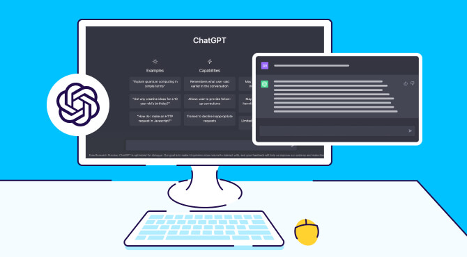
Maybe you’re anxious to know what common UX mistakes to avoid, or which trends you should incorporate in your design. Or perhaps you’re curious about the apps your audience uses most. Typing prompts like these into ChatGPT is a quick way to gather information, without trawling through tons of less-than-helpful websites yourself.
You’ve sent out your surveys and done your interviews — but how do you make sense of all that data? To get the headlines in a hurry, you can tell ChatGPT to summarize the findings or pull out keywords, for example.
Don’t worry, we’re not suggesting you replace your designers with robots. But if technology can help make time-consuming tasks easier, or offer a fresh spin when you hit a creative block, why not add it to the mix?
There are three main points to remember when it comes to mobile app UX. Get these right, and you’re well on your way to getting your app on users’ home screens:
Above all, when designing features or developing flows, ask yourself how you might make something simpler, faster, smoother, and more enjoyable for your users. Technology can help you, but there’s no substitute for genuine user testing, reviews and feedback.
Mobile app UX (user experience) is critical because it directly impacts user retention and satisfaction. Making your app simple and enjoyable to use will keep users coming back, boosting your lifetime value.
Mobile UX is focused on single tasks with space constraints, while desktop UX allows multitasking with larger screens and more stable environments. With mobile overtaking desktop usage, designers should take a mobile-first approach and ensure smooth journeys between devices.
Seventy percent of users will abandon an app if it takes more than five seconds to load, making speed crucial for retaining users.
A/B testing allows app designers to compare different design elements, helping identify what improves user interaction and optimizing the user journey.
Constraints force designers to prioritize essential features and streamline the user experience, ultimately improving usability and focus.


