5 ways to analyze app campaigns using marketing analytics


Understanding your marketing data can be a confusing business. The graphs may look engaging, but if you don’t know how to differentiate between them they lose their inherent value.
Managing and studying each metric can be done via the marketing analytics reports which allow you to deconstruct the data, highlighting trends and delivering insights.
Applying these insights to better optimize app campaigns is key to success.
At least 99% of apps in the app stores are free to install. In this reality, even if you successfully drive app downloads, you are still yet to generate any revenue. Therefore your campaigns must be optimized to attract loyal and engaged users who will ultimately drive revenue.
Marketing analytics reports use the data to highlight which media channels attract the highest value users — those whom the apps can monetize.
In this blog we will review 5 different reports and see how each of them plays a key role in optimizing your app campaign.
1. LTV report
An LTV or lifetime value report offers marketers data about all events performed in the app during a set time frame since installing the app.
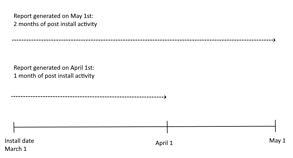
The use of the word lifetime can be confusing, so to be precise lifetime means to date (or to the day the report was generated). An LTV report based on users who installed during March 1st and generated on April 1st covers a month of post-install data; if it had been generated on May 1st, it would cover two months of data.
In an ecosystem dominated by the freemium model, the LTV report provides vital information about the real value of users across a variety of metrics, whether engagement-related or revenue-related.
It is important to separate between LTV, which is essentially the revenue generated by a user in a given time frame, and an LTV report which covers a variety of metrics that measure post-install behavior.
LTV reports will therefore help you compare the quality of users from different channels, media sources, campaigns, and even creative variations, and optimize accordingly.
So, for example, media source A delivers a higher number of installs, but media source B delivers fewer users who spend more. In such a scenario, the marketer should increase the budget for media source B, and consider decreasing spend on media source A (assuming it is able to generate some scale and is delivering a positive ROAS).
In addition, it offers valuable information about different groups of users so you can compare their post-install value, and better understand what characterizes each group — when they installed, from which region, and what did it cost to acquire them.
In this case, you could compare the revenue generated after 30 days by users who installed on March 1st vs. users who installed on April 1st.
Armed with this data, you can quickly find out which users from which sources deliver real value and equally important which don’t. It is the basis of decision-making and allows you to optimize your campaigns accordingly.
Let’s look at an example of an app’s data set and try to understand where the marketer is succeeding in their campaign, and where some optimization is needed.
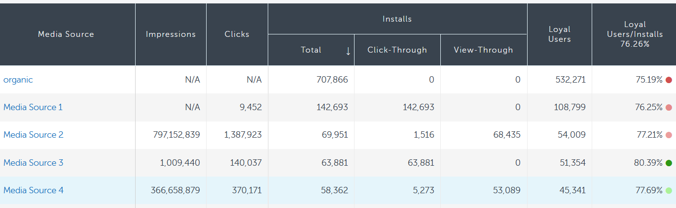
The above LTV report of users who installed during the first week of November shows that, after 30 days, Media Source 3 delivered users with the highest overall loyal user to install rate. Media Source 1, on the other hand, drove more than double the installs but had a lower loyal user rate.
The marketer can then decide whether to allocate more resources to Media Source 3 (if they focus on loyal user rate), or Media Source 1 if they want increased scale but a slightly lower loyal user rate.
User acquisition (UA) campaign checklist for 2022
Thank you for downloading our checklist!


2. Activity report
Activity reports measure events performed by active app users within a given date range regardless of their install date. Activity reports are important because they can help measure the effectiveness of a channel or media source within a specific time frame.
They can be useful for analyzing performance around a specific highlight in the calendar such as Black Friday or the holiday season. You can also use activity data to see how much revenue was generated by all app users in February, and then compare it to February of last year, or to January.
Of course, Activity reports deliver an alternative view of the data, but nevertheless will highlight important trends. You can then use these trends to optimize your app campaigns by assigning more or less budget to a specific media source.
The next time you have a similar event or date range you can take these insights and apply them to your app campaign, optimizing your spend and delivering improved results.
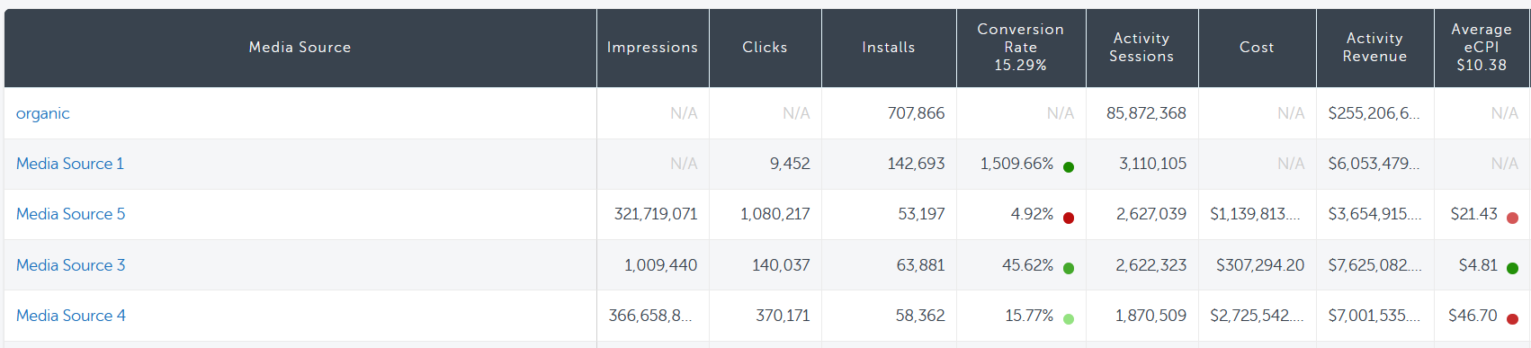
Here we have taken data from the same app and are now looking at it from the prism of the Activity report. Looking at the number of activity sessions, there is a new Media Source (5) that is delivering the highest number of activity sessions during this time frame. It is worth noting that they were not in the top five number of loyal users in the LTV report, but do feature highly in the Activity report.
However, Media Source 5 has a low conversion rate and a high average CPI (Cost Per Install). So, while the data shows us a high level of activity it also shows us that there is a low conversion rate, and so it appears that there is room for improvement and optimization of Media Source 5. Looking again at Media Source 3, we again see an above average conversion rate and CPI.
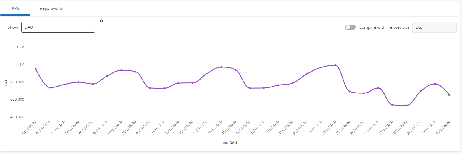
The Activity report can also show us how a selected KPI performs over the same time period, as well as drill down to a specific activity in the app, such as a purchase.
In this example, we can see that on 26/11 there was a drop in usage in terms of DAU (Daily Active Users). A marketer can investigate if there was a reason for this drop in usage.
3. Retention report
We mentioned earlier that having a user download and install is just step one. However, the real work is still ahead of you. Retention is all about ensuring that a user actively engages with your app post-install.
Securing loyalty is a huge challenge because of fierce competition (there are millions of other apps to compete with) and increasingly high user expectations.
Retention is crucial to optimizing app campaigns as it is the basis of monetization. Retention reports pinpoint the moment when users start to drop off, and inform you when it’s important to optimize, or re-engage.
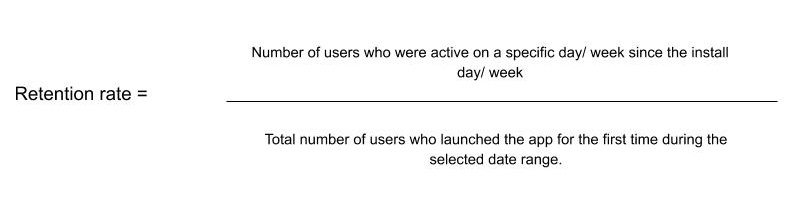
The retention rate is calculated by dividing the number of users who were active on a specific day/ week since the install day/ week by the total number of users who launched the app for the first time during the selected date range.
Retention reports will also show how different channels perform over time and what the overall retention rate is. So Network A may have a higher number of users but Network B may retain a higher percentage of users over time.
These insights help you understand which media sources deliver users who will keep coming back to your app, and optimize your app campaigns at the right moment to re-engage users when they would otherwise drop off.
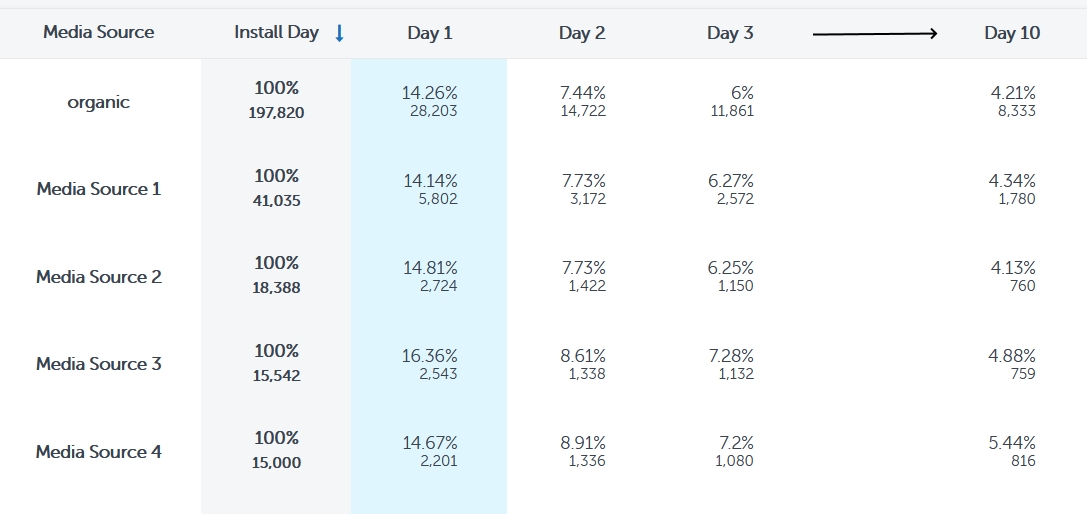
Here is another way of looking at the same data which shows us an interesting twist. In the LTV report, Media Source 4 had the 2nd lowest loyal user to install ratio (loyal users are counted when a user completes 3 app sessions).
However, from the Retention report we can see that over the course of the first 10 days, it was consistently the media source with the highest retention rate.
This may go some way to explaining why this app marketer is deciding to invest in this media source – which delivers users with the highest likelihood to open the app on day 10 (even if the ratio of highly engaged users is low – probably the result of more play early on, but faster churn).
Report
2021 app retention benchmarks
4. Cohort report
Cohort reports are a way of segmenting the data by taking a subgroup of users who share a common characteristic, for example, those who installed on the same day from the same country. By applying specific parameters, filters, or dimensions to the data you are able to slice and dice it differently to add context.
By adding context to the data you are able to drown out some of the background noise and show a different trend which may not have been noticeable when the data was broader. You can identify areas of success and failure in your app campaigns and optimize accordingly.
The cohort report may show which channel brings in more engaged users in a certain time frame, or from a specific location which would have otherwise gone unnoticed.
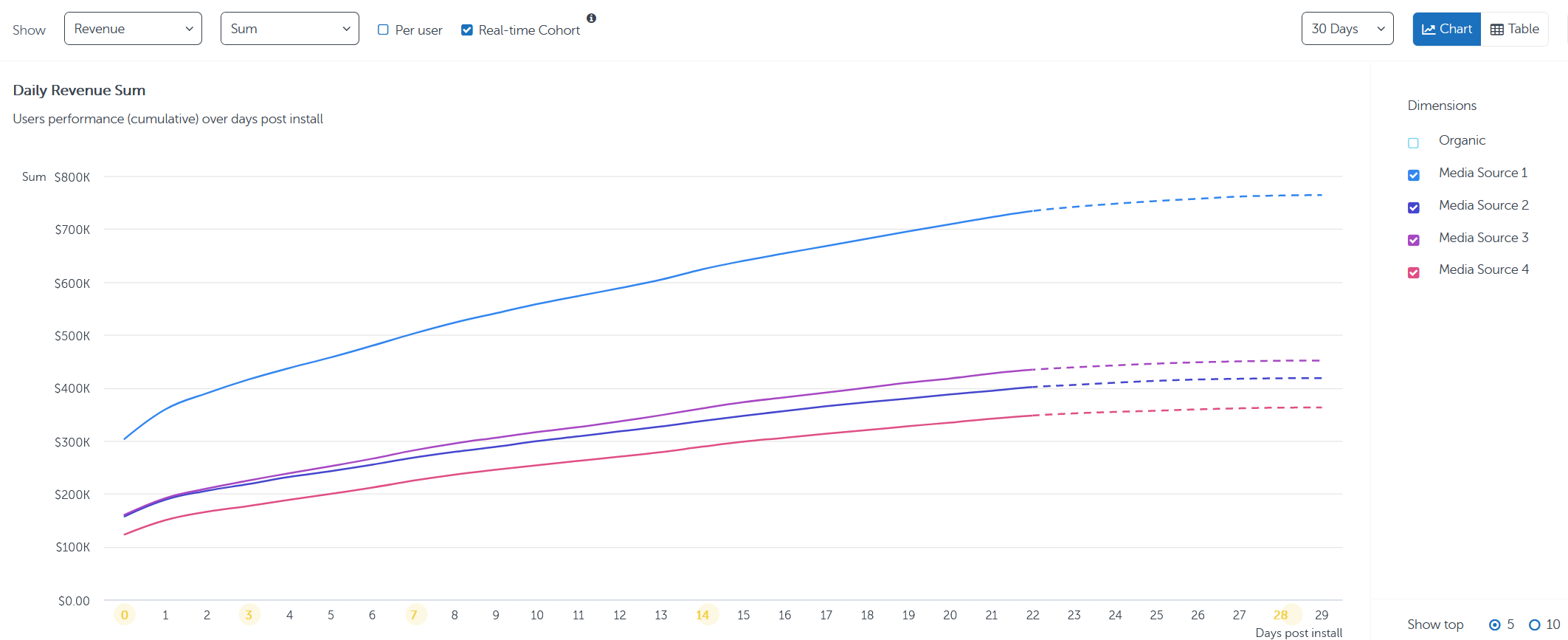
The figures in a cohort analysis are often displayed in a cumulative view (although they can be viewed in other ways too). This helps to clearly show the rate at which the selected KPI, in this instance, revenue, is growing. In addition, if we have a specific target we can, with a cumulative view, easily see how many days it will take to hit that goal.
For the purposes of this report we have removed the organic channel from the graph. So, whereas previously we have focused on Media Source 3 having the highest rate of loyal users, we can see here that Media Source 1 delivers the highest revenues, although the rate of revenue generated by this cohort over time is similar across media sources.
If we change the cohort report to look at KPIs by install date we see the results take a different shape. We can see from this that after three days the most revenue, by far, was generated by those who installed via Media Source 1 on November 22nd. Diving deeper into this day can provide valuable information regarding success factors (e.g. creative, campaign time of day. etc.)
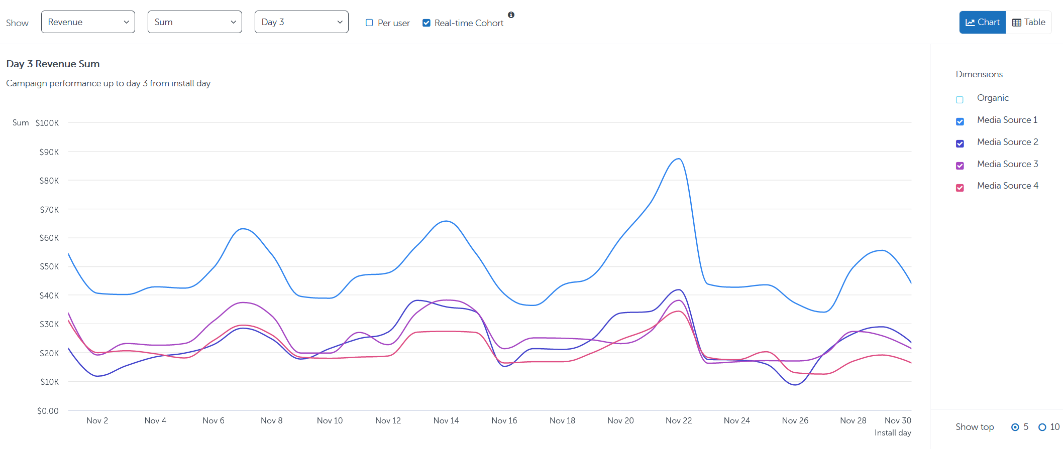
The other trend that stands out is that, as far as we can tell, the waves show that users who installed on a Monday or Tuesday generated the most revenue, so this could be a point for further investigation. Was there significant UA activity on those days? Did your app offer unique promotions on those days? Were there other external factors which caused the increase in sales or is there a trend within this cohort?
Having this information can help you optimize your app campaign by knowing that Mondays and Tuesdays are the most lucrative and therefore more budget should be invested in your campaigns on those days.
In short, cohort analysis creates visible trends that immediately highlight the performance of your campaigns.
5. Remarketing report
Remarketing (also known as retargeting) is a key part of any app marketer’s toolbox. It aims to re-engage with existing app users across paid and owned channels to help drive loyalty. With most apps losing 95% of their users within the first 30 days, remarketing becomes vitally important in the fight against churn, as its cost is much lower than the cost of user acquisition.
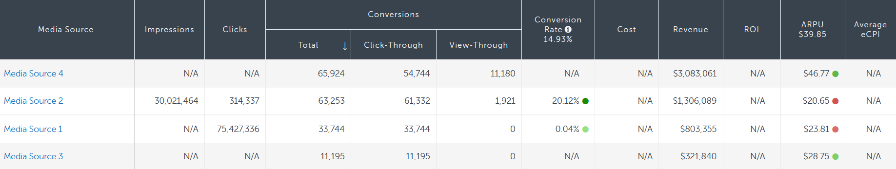
For whatever reason, despite not registering impressions or clicks, Media Sources 3 and 4 still managed to generate additional revenue as a result of their remarketing campaigns. Media Source 2 has invested heavily in their remarketing campaign and achieved a high conversion rate, but a low ARPU (average revenue per user).
In this example, Media Source 4 is in a league of its own as far as revenue per user goes, so it would be wise to consider allocating more budget to this network.
LTV vs Activity reports
It is important to remember, that with the exception of Activity reports, all Marketing Analytics reports are based on LTV data. That is to say, they all use data related to when the user installed and then view what happened post conversion up to a date of their choosing. Activity reports differ in that they are only interested in the total activity for a specific day/ week/ month etc, regardless of when a user converted
To explain this we can use the train analogy. Imagine you are on a railway platform watching a train pass by. In a single moment you can see only the activities performed by all the passengers at the same time. This is activity data.
Now imagine you’re inside one of the railroad cars. You can now see all of the activity and interactions performed by the people who boarded the same carriage at the same time as you. This is lifetime value data.
The same data through different prisms
By exploring the same data through different prisms we are able to see that each report has its own inherent value to the marketer in helping to pin-point trends and deliver insights. Combining the collection of reports gives a broad, but also granular view of which app campaigns worked and which didn’t depending on which KPIs you want to focus on.
The bottom line: Marketing analytics reports for app marketers are must-have, powerful tools that turn data into insights, and ultimately into the right investment and optimization decisions.